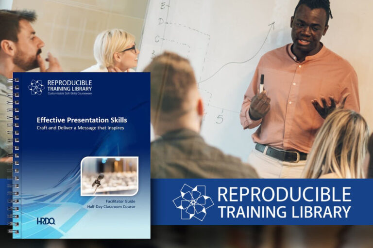
Awesome PowerPoint Techniques for Effective Presentations | HRDQ-U Webinar

Awesome PowerPoint Techniques for Effective Presentations

SHARE
SHARE
SHARE
EMAIL
PRINT

Overview

Why are most presentations so bad? Truly terrible? They’re too wordy, text-based, and generally dull. They don’t tell stories that engage, excite, or inspire. And they generally do little to actually help people learn. They are linear and non-responsive, with no interaction. Pretty much everything you know doesn’t work to convey information effectively. Few people enjoy creating, delivering, or watching PowerPoint presentations, so let’s change that.

This session is packed full of techniques to create mind-blowing presentations. Want to know how to create visual slides, manipulate images, master animations, make it interactive, and produce presentations that will astound your audience? Then come along for a masterclass in ways to capture your audience’s attention and help them learn.

This is a highly practical session in which we’ll look at techniques to create amazing slides that work effectively, apply them to real-life before and after examples, and look at how to use those skills on many other slides when you’re developing your own presentations. And, because it’s all live in a single session, you can see just how quick it is to create compelling visual presentation content – so there’s no excuse for bullet point slides! So, don your thinking caps, and get ready to critique some dreadful ‘before’ slides and take part in transforming them into truly mind-blowing presentations that will energize your audience and make your next training course the best ever.

Attendees will learn

  • How to create dynamic visuals that support persuasive stories.
  • How to develop professional looking designs for presentations and other content.
  • How to make interactive visual content to engage your audience, whether in person or online.
  • How to become a PowerPoint legend with techniques to make effective presentations quickly and easily.

Presenter

Richard Goring is a Director at BrightCarbon, the specialist presentation and eLearning agency. He enjoys helping people create engaging content and communicate effectively using visuals, diagrams, and animated sequences that explain and reinforce the key points, which is supported by plenty of resources and tips at www.brightcarbon.com. Connect with Richard on Twitter and at www.brightcarbon.com.

Sponsor

What’s My Communication Style assessment
What’s My Communication Style?

Communication skills are critical if your organization is going to perform at its best – particularly during challenging times. You can dramatically improve communication skills by building a better understanding of personal styles and their effects on others. With the What’s My Communication Style assessment, learners engage in a proven process that identifies their dominant communication style and the communication behaviors that distinguish it, then teaches them how to flex their style with colleagues for optimal communication. Learn more about What’s My Communication Style.

On-Demand Webinar Recording
Play Video

Awesome PowerPoint Techniques for Effective Presentations

0:02

Hi, everyone, and welcome to today’s webinar, Awesome PowerPoint Techniques for Effective Presentations. Hosted by HRDQ-U and presented by Richard Goring.

0:13

My name is Sarah, and I will moderate today’s webinar, The webinar will last around one hour. If you have any questions, please type them into the question area on your GoToWebinar control panel, and we’ll answer as many as we can during today’s session. So make sure you’re regularly putting those questions in the questions box, as we’ll be answering them.

0:31

As close to real time as possible, today’s webinar is sponsored by the HRDQ, What’s My Communication Style Online Assessment and Training Course. Communication skills are critical if your organization is going to perform at its best, particularly during challenging times, dramatically improved communication skills for your employees, through a better understanding of personal style, and the effect on others. What’s My Communication Style Assessment is just 20 minutes to an aha moment. Learners engage an approval process that identifies their dominant communication style and the communication behaviors that distinguish it. Teaches them how to flex their style with colleagues for optimal communication.

1:15

Learn more at www.hrdqstore.com/wmcs, where you get to take a free test drive up the online assessments.

1:26

I’m excited to introduce our presenter today, Richard Goring. Richard is a Director at Bright Carbon, specialist presentation and e-learning agency, and today he’s going to teach us some cool tricks about presentations and PowerPoints, so thank you for joining us today, Richard.

1:43

Thank you so much for having me. Hi, everyone, and we’ll come into the session, as Sarah said, we’re going to be doing all sorts of different bits and pieces to do with PowerPoint and ultimately to create presentations.

1:53

So, what I thought I’d do is start off with a brief question, which is, what is it about most presentations that, so, what’s the word?

2:02

Most presentations are, let’s be honest, pretty terrible, ignored, and sat there, wondering why they’re bothering, and there’s even a term for it, we call it, Death by PowerPoint.

2:10

When was the last time you had death by something? I thought it was a good idea to keep going other than chocolate, which is the exception that proves the rule.

2:18

Now, you see, one of the major contributors to Death by PowerPoint is using slides that spell out exactly what you’re trying to say.

2:25

The issue is that the word you see on the words you hear, a rule processed in a single part of the brain may call the phonological loop. And that means that it’s virtually impossible for people to be able to read and listen, the same time, you get interference effect going on, which is one of the underlying reasons why you wouldn’t just left feeling a bit confused, which really isn’t what you want in the presentation.

2:47

The other problem wrote into the generally going to be bright, inquisitive, intelligent people. And so, they’re going to try to understand what’s in front of the sower, tends to happen as well, this.

3:01

And because of this.

3:05

You get that.

3:09

So you’ve read the slides, you just want to move on. You don’t want to listen to me talk about it some more, but inevitably, presenters will desperately try to add some value to whatever Warren pieces up on the slide.

3:18

That means that 1 or 2 things is going to happen, either they’re going to ignore you and just move on. Or you’re going to become really irritating neither of which you particularly want.

3:28

So, the answer, as I hope is obvious from what I’m showing you here, is to get rid of text and bullet points from presentations, that’s for documents. And instead use visuals, diagrams, and animations that explain and reinforce your messages.

3:42

Critically, if you can synchronize that up with the narrative, what you as a presenter are saying, then you can encourage something called dual coding of information, where the whole thing comes together in a seamless, multimedia experience and everyone is delighted, unhappy, and the whole thing is successful.

3:59

So, that’s the set up for today’s session.

4:02

What I thought would be a good use of time is to go through and show you lots of different techniques live in PowerPoint of how you can start to build up more visual content.

4:13

Now, there’s loads of different things that we could do. And so I thought, you know what? Let’s make this session something where we’re going to go through reasonably fast, show you lots of these different techniques and ideas and tricks, and then give you the opportunity to pull out the ones that are going to be most useful to you, and then try and apply them over the next few days and weeks.

4:33

So, I’ll go through quite a lot of stuff, quite quickly.

4:36

If there are any questions, as Sarah said, please do type into the questions set, and we’ll answer those as we go through.

4:43

But also, there is, of course, the recording, and if you’re watching the recording, hello. Thank you so much, but also in the handouts pod area, you can download a PDF Guide with step-by-step instructions for everything that we’re going to cover, and also links to short video tutorials there as well. So you can look at two minutes, three minutes of the particular bit.

5:05

So hopefully this is a session that will inspire you to then go away and try out some of the ideas, but please feel free to ask, ask questions as we’re going through it.

5:14

So if that’s OK for everyone, let’s jump into it. First thing that I want to look at, is productivity being able to navigate around PowerPoint to create the stuff that you want really quickly. And one of the things it’s vital for that is using the keyboard shortcuts. So, if I go into Edit mode here in PowerPoint, I want to do something really basic to start off with which is to draw a square.

5:39

I’m sure you all know how to do this. You go to the Insert tab on the ribbon. You’ve got the Shapes Gallery here, on the left-hand side there. You got all your shapes, anything, correct?

5:49

Hang on a minute. There are no squares in this field, the remote rectangles and I thought mathematically possible, but no squares.

5:58

And so what most people do is choose this basic rectangle, and then guess it’s never going to be right though.

6:04

So, instead of that, I would press and hold the shift key, when you are creating a shape. And what that does is it creates a perfectly squared version of the shape. So a rectangle becomes a square with the Cube Shift key held down, or an oval, for example, would become a perfect circle.

6:21

So, the Shift key is really useful. And with this, you let go of the Mouse button first, and then you let go of the Shift Key. So, Shift Key, you’re super useful for creating content.

6:31

The Shift Key is also useful for moving content, as well.

6:34

Here, I’ve got a little shape You can click, and you can drag it any way you’d like. Again, everyone will be familiar with that.

6:40

But if you want to, you can press and hold the Shift key. And that will then lock the horizontal or vertical position, meaning, you can only move left and right, or up or down.

6:49

So that’s great if you want to do some fine detail adjustment where things can be moved around and not get misaligned with other objects.

6:58

And another really useful tool is to use the control key in PowerPoint. I’m sure you’re all familiar with the keyboard shortcut for Copy Paste, which is Control C and Control V.

7:08

Why is it that it pastes just to the right, and just below the original object? In 20 years of doing this, I’ve never once wanted to be there, and now I’ve got to click and drag it somewhere else. Which is annoying.

7:20

So instead of that, I would do something called a copy drag.

7:24

If you press and hold the control key and hover your cursor over an object on the slide, you might just be able to make out this little plus next to it.

7:32

What that means is that if you click on this object and drag it somewhere else, you will drag a copy of the object.

7:39

I’m then going to let go of the mouse button, and then let go of the control key.

7:43

So the Copy drag is super useful.

7:46

And you know what? You can also combine the copy drag, the control key with the lock position, the Shift Key. So I can now do a copy drag, and a copy drag, and a copy, drag super quickly and easily, to have a whole lot of objects duplicated in line with the original.

8:03

So really quickly and really easily, you can use a chunk of these keyboard shortcuts to create a slide like this, for example.

8:10

No, yes. It’s not a complicated slide.

8:13

I admit it, but all it’s taken is about a minute to create, suddenly under a minute.

8:19

Got a nice picture in the background, talking about where to get pictures in just a moment, created a shape, done a copy drag, change the colors really quick, and really easy.

8:29

So there’s a keyboard shortcuts, I think can be super helpful when you are creating presentations. And so it’s well worth knowing about them. If you want to take a screenshot at this point, you absolutely can do here of 20 or so of the keyboard shortcuts that we use most frequently for Windows. The following slide is for Mac, don’t worry, though. These are all in the handouts pod, so handout there, the PDF, So, you’ll be able to access those, if you want to. And if anyone wants to get them immediately, you can go to the bright carbon website, bright carbon dot com, and just do a search for keyboard. And then, this article here will come up, which gives you the ability to download these has one-page PDFs, so that kind of things should be useful for you.

9:13

So it’s definitely worth taking a look at some keyboard shortcuts, seeing what you can do with it.

9:18

Next up is looking at some of the functions in PowerPoint that allow you to boost productivity and create stuff really quickly as well.

9:26

Let’s imagine the scenario, if you will, of creating a presentation to plan for the year ahead. You know, really good time of year to do it. And so you’re going out to the team with a strategy for what you can do. So, our journey ahead come up with a nice picture of a road in the background, to represent that journey. And then three main points that I’m going to structure the story. It’s a nice, looking slide. It’s well presented. It’s clear. It’s going to do a good job. You’ve done a good job. You are rightly proud of it.

9:54

Then, you know, partly because you value her opinion, but also because you want to show off, you, decide to send it to your boss, and she says, I like it. Just made a couple of changes. Can you tie it up? And what you get back is this. And you think, Oh, good grief.

10:05

How long is it going to take to fix that?

10:08

Well, fortunately, the answer is just a couple of seconds by using something called the alignment and distribution tools.

10:15

Now, these are, I think, the single most useful content creation tool in PowerPoint. And they allow you to line things up relative to each other.

10:26

So if I were to select all of these black circles here, go to the home tab on the ribbon.

10:32

Over on the right-hand side, you’ll find this little yellow and white box icon here called arrange.

10:39

If you click on that, down to the bottom, is this thing called a line. And this gives you six different options that are light allowing the objects up relative to each other.

10:49

So again, if I were to choose a line left, it will line all of the objects up to the leftmost portion of the leftmost shape.

10:57

If I were to go back to home, arrange, align, and choose to align top, it will align all of them to the topmost portion of the topmost shape like that.

11:06

Now, that’s terrific. They’re all nicely lined up, but there’s still there’s an overlap here. There’s different spacing there. It doesn’t quite work.

11:13

But if you go back to the home tab and arrange and align again, there are two more options that allow you to evenly space these out.

11:21

So if you choose distribute Horizontally, it evenly spaces them. So that now this the same spacing and gaps that you see super quick and super easy to be able to make sure that things are nicely lined up.

11:33

And as I said, I think that the most powerful content creation tools in PowerPoint.

11:38

And yet they are hidden away in a sub menu of a sub menu of a sub menu, which had just thought is ludicrously. Who thought that was a good idea?

11:47

The only explanation I can think of is that its whole crux is because they don’t want you to find that. It’s ridiculous.

11:55

And so instead of having to go through that journey to Mordor, I would recommend that you customize your PowerPoint using something called the Quick Access Toolbar.

12:06

Now if you’ve never used it before, you do all have it, and it’s this row of icons that I’ve got on my slide here.

12:13

This row of icons is the Quick Access toolbar. And it allows me to add any functions I want to it really quickly and really easily, so I don’t have to go through sub menus or go to the different tabs.

12:26

If you’ve never used it before, it’s going to be up in the top left-hand corner of your PowerPoint screen up here like that. And it’ll have a few icons on it, things like save, undo, redo, that kind of thing.

12:39

So the first thing to do probably is to right click on one of those icons and choose Show Quick Access toolbar below the ribbon.

12:48

That will then bring it down closer to the slides.

12:50

It minimizes mouse mileage, but also, it gives you the full width of the screen available, and then you can add any frequent functions to it really easily.

13:00

So, if you’re always using the new comment function, you can go to the review tab, find new comment, right, click on it, and choose to add to quick access toolbar, or if you’re always using the, the format background function, for example, go to the design tab, find it on the right-hand side here, right click and choose add two quick access toolbar, so you can start to populate it with loads of stuff. And I’ve done exactly that with the alignment tools. So, I’ve just come to the home tab, arrange, Align, and right click on each of these, added them to the quick access toolbar.

13:34

And here they are front and center, which means that I can go back, and all these extra bits here. I can just select those, Do, align center, select, those to, Align Center, Select, all of those to align top and distribute, and it’s done really, literally, A couple of seconds. Quick, easy. Yes. We had a question come through that’s relevant to tabulate to know if this can be, if this this trickier can be used for Word as well. Absolutely. Every Office program has a quick access toolbar.

14:02

So Word, Excel, Outlook, you can add them. And they’re all different because they’re different for each program so you can customize something for PowerPoint, customize them if a Word customized, somebody freaks out.

14:13

And again, I would strongly recommend that you do, because it can be a huge timesaver for all the functions that you use frequently.

14:23

Now, if anyone wants this PowerPoint version, again, there’s a link in the handout that you can get in the PDF. But you can also, again, go to the bright carbon website, bright carbon dot com, and just do a search for quick access toolbar, and then, you’ll be able to not only see more details on this, but also download this quick access toolbar here. It is not to say that this is the best quick access toolbar.

14:46

It’s just that this probably has a chunk of stuff for you. Want to download it, save your chunk of time, and then customize it further to make it your own. If you’ll never use the layer functions, right, click on them and remove. If you want to add anything else in, go into it, right click, and add.

15:04

So definitely create your own, but this might be a good starting point, and you can download it from our website, use it however you like.

15:14

So a combination of keyboard shortcuts and functions, and the ability to access them in the quick access toolbar, I think, can be a huge boost to productivity, because you don’t want to let PowerPoint get in the way of creating the slides that you want.

15:31

You can take it even further to boost productivity. Though, I feel that forgive me. just 2 or 3 minutes of shameless plug in here, you can also use add ins for PowerPoints.

15:42

one ad and you can get, is something called Bright Slide. Now. Bright slide is an agenda that we have created a company that I work for bright carbon. Don’t worry. It’s available completely for free, so I’m not trying to sell you on anything here, but what it does is it appears as a new tab in the ribbon, and it has all sorts of functions and that are designed to boost your productivity when you’re creating slides. If I just ludicrously, quickly go through a couple of examples. You know, we talked about the alignment and distribution tools before, so I can select all of these two-line tops, and I can distribute done.

16:15

But what if I wanted to line up this line, and this text box, with this circle here? Now, they are really far away that kind of really distant.

16:25

If I were to choose a line object center, what happens is, they all line up, but the so-called moves, but I wanted the circle to be in that place.

16:36

And the problem is that the way these tools work is not logical to our minds, but it is logical to PowerPoint, which isn’t really very helpful.

16:44

I used some horribly flowery language earlier, about lining up to the leftmost portion of the left my shape.

16:51

Partly, that’s because I’m British, but mostly it’s because that’s how it all works.

16:57

If I take just three, these three objects here, you see the leftmost portion of the leftmost shape is actually this text box here like that. So, just draw a line, so you can see where that is.

17:09

The rightmost portion of the right most shape is the circle.

17:13

If I were to take the center point between those two lines, that’s where it is. And so, I find, now align those three. You see that, they line up with that. So that’s the logic behind it. That’s how these tools work. It’s just not how you want them to work.

17:29

And so, one of the things we’ve done in this bright slide add in is modify how the alignment tools work.

17:35

So, if you do download the bright slide add-in, which, again, you can get completely for free from the … website, go to the Bright Side tab and choose the Alignment tools on the left.

17:45

Here, you have the ability to choose how they work, so, you can choose aligned to the selected objects, the default, but you can also now choose to align the thing you selected first or align to guides or aligned to the slide.

17:58

Because I hate sub menus, we’ve also got keyboard modifiers in here, as well.

18:03

So if you press and hold the Shift Key, it will toggle on that align to first selected. So now I don’t even need to go to the bright slide tab. I can just press and hold the shift key and use my quick access toolbar here, to then say, Align to first selected.

18:18

And so now, again, I can take something that would otherwise be really time consuming and complicated, and just use the shift key occasionally to then get everything right. So that now, it’s all lined up.

18:30

Couple of other things really quickly here. We’ve got a whole lot of icons. They’re all different sizes. So I can select them all. Go to bride slide. We have a tool called Match Size, which makes them all the same size, but there’s still randomly spread around. So we’ve got a new form of distributed here called Distributes to Grid. And that brings up this tool, which allows you to choose how many rows, or how many columns the raw, and also how far apart that space as well. So that you’ve got everything nice and neatly laid out or if you’re dealing with really complex slides, here’s an example where you realize, oh, these map markers. They’re not really given me enough contrast, so I need to change them.

19:07

But now I need to select all of those, that one, that one known, and it’s, like, it’s complicated to try and find the one you want and select it.

19:16

And so what we have in Bright slide is a tool that allows you to select all of the objects with the same attribute.

19:22

So I can choose the same fill color, or the same shape type, by two same fill color. It selects all of those, and I can now choose to give them a better color.

19:31

I also want to animate these, so, you know, the map makers don’t animate at the moment, and so I can now say, I want to select all the map markers.

19:40

Choose to select all of the same shape type.

19:43

Could use a standard animation that can be a bit dull at times. So in bright slide, we have an animation library, which gives you a whole lot of different effects that you can apply. Now, these are all standard in PowerPoint. It’s just a combination of effects, so it will all work in any other version of PowerPoint as well. So, we’ve got a few that you can choose from, but you can also create your own. And you can edit this library to have any kinds of combination of effect you like.

20:09

I’m going to choose something called bounce entrance here, because I quite like the way that we combine three different animations together to achieve kind of quite a nice little kind of pulse effect.

20:20

Still a bit annoying. The way that it all comes up in one go. So what I can do is use another utility in bright slides to then stagger all of these. So I’ve got a waterfall delay tool that allows me to choose what kind of animations to include and also the delay in timing, choose, OK?

20:36

And now in PowerPoint show mode, it will come up and bring it all up and kind of stagger that across. You can do all of that natively in PowerPoint. It would just probably take, you, know, 7, 8, 10 minutes or so.

20:48

Whereas you can do it in, you know, 30 or so using these kinds of tools. So it’s well worth investigating add ins. As I said, bright slides, you can download for free from the black carbon website, but there are loads of add ins out there that enable you to do lots of things quickly and easily.

21:06

So if in general you have a problem, something that feels really dull and repetitive in PowerPoint, maybe there’s an ad in out there that will help you. And again, in the PDF Guide, we’ve got a list of about 12 or so different audiences that might be worth investigating from all sorts of different people. Some of them are free. Some of them have to pay for, but they’re not very expensive, but maybe see if they can help you out at all.

21:30

We have another question. From Melody and Melody said, I find add ins can start to make PowerPoint work. Walk. He has this gotten better since newer versions of PowerPoint have come out.

21:41

Yeah.

21:42

Yes.

21:43

It depends a little bit on what the ad NAs, so they can be programmed in different ways. And Brian slide, for example, is quite a lightweight ad, and so it’s not going to be taxing on the system. It’s not doing anything other than automating a lot of stuff.

21:58

There are some add ins that will try to put in custom bits of code into your PowerPoint file, which means that it’s there not compatible with other versions of PowerPoint and stuff. And that’s typically where it can go a bit wonky where it can be a little bit tricky. So, have a think about what the add in is doing.

22:19

Because some are productivity boosting like this, others are links to websites. So, if you go to the Insert tab and get added for example. This is a good site for different types of add ins that will give you access to content things like pick it for example, or pex ELs all the Noun Project or Adobe Stock, they’ve all got patterns, which is just a little pain that comes up on the right. That, that essentially gives you a web browser that so those will review lightweight add ins. But other ones will do actual content and functionality, which, which are the ones to be wary of.

22:57

And to further that point, do you suggest having multiple ad ends added, or just pick one and standing, instead of having multiple ad ends on the software?

23:06

Oh, it depends on what you’re trying to do. So some add ins do just a single thing. They do that single thing really well, but they’re super lightweight, so it’s just adding a single button either in the home tab or somewhere else that you so it’s useful. So there’s no problem in having five of those, for example, versus one add in that does all of it. So I would have a look to see the add ins you like to use, if you’re concerned about stability, maybe add them in one at a time, and just have a few days with it to see if it’s causing your problem. You should know pretty much immediately when you’re using it if it’s going to cause your system to go wonky. But as I said, for the most part, they are generally very good, so it shouldn’t cause too much problem.

23:46

one more question from this section here from Christopher and Christopher would like to know if Bright Slide is, can be used on Mac as well, or is it only, Windows they can Indeed. Yes. There are very few add ins available for Mac. And we were determined to make bright slide one of them, So yes, it can be used on Mac.

24:08

OK, right. So that is, I think, a good amount of stuff to do with just the tool. So figuring out kind of how to use it. What I wanted to do now is think about ways that you can actually start telling the visual stories that we mentioned at the start.

24:25

one of the things that you are absolutely required to do when creating an effective presentation, is to make sure that you’re helping your audience to understand. And if you put up really complicated slides, they can get lost really easily, especially in fuel presenting, in a remote environment, like we are now.

24:44

A very useful tool or technique to be able to capture your audience’s attention, especially with complex slides, is to use custom masks. So, here, we have an example of a slide that we’ve created one of our clients, where they want to talk about the office spaces that they create, and the different elements of this space. That will really impress people that they when they walk in.

25:06

So we can build this out to, say, here’s the space, and then click. These are the different things that really capture the attention, and make people think, Yeah, I like that.

25:14

What we’ve done here is to create a custom mask that allows you to focus your audience’s attention on the bits of the image or graphic that are relevant.

25:24

Now, the way this works is a little bit counter-intuitive at first, and it’s a two-step process once you get it really quick and really easy, but it works very powerfully.

25:34

So, what I’m going to do is go to a blank version of this slide with just the picture, And the first step in the process is to create some custom shapes around the objects that you want to highlight.

25:46

Now, the way to do that is to go to the Shapes Gallery. So, the Insert Tab, and shapes and underlines. Second, from the right-hand side here is this little squashed pacman type thing called Freefall.

25:59

That allows you to create any custom shape you want.

26:03

Now, it’s a bit counter-intuitive, because the way this works is unlike any other shape in PowerPoint.

26:09

What you have to do is, once you’ve selected it, click where you want the shape to start, and then let go of the mouse button.

26:17

I then want you to move the cursor but don’t click the mouse button and you should just be able to make our little, thin, blue line that’s following the cursor.

26:26

This is going to trace the outline of any custom shape I want.

26:30

If you then click on the top right-hand corner of the mirror, I’ve now got a thin blue line across the top and then, again, it’s tracking the mouse.

26:38

I’m going to click in the bottom right and let go click on the bottom left and let go, and then I’m going to bring it back up to the start and the top left.

26:46

Once you bring it to where you first clicked, it will turn into color.

26:50

In this case blue, I can now click, and I’ve now got a custom shape traced around that mirror. I’m going to do the same thing with the desk. I’m going to click on the top left, and let go, click in the middle of that go, click in the top right, and let go. And the trick with this is exactly that point of click and let go and click on that curve.

27:07

Because if you hold your mouse button down, which is what you would do for every other shape and PowerPoint, PowerPoint thinks you’re clicking furiously and you’ll end up with lots of wiggly lines, which looks really terrible.

27:18

But, otherwise, it’s nice and quick and easy.

27:20

And now, I’ve got those three custom shapes.

27:24

Now, what I’m going to do is draw a rectangle that fills the entire screen. And let’s just get rid of the outline of that and turn the color black, and then just send it backwards through the layers so that you can now see the, the three blue shapes over the top of the black rectangle.

27:42

So that’s the first piece.

27:44

The second piece, then, is now to use these custom shapes, these blue shapes to cut holes in the black rectangle to reveal the image underneath.

27:55

So the way to do that is to select the black rectangle, and then do a shift click to select the three custom shapes.

28:03

If you then go to the Shape Format tab on the ribbon, over on the left-hand side, you’ll find this little Venn diagram thing here called Mudge Shapes, and if you click on that drop-down, you’ll have five different options that allow you to manipulate the shapes relative to each other.

28:19

You can do all sorts of things with this, but the one at the bottom that subtract is what you most likely want because that will cut those blue custom shapes away from the black rectangle, giving you holes in it that allow you to see the image underneath.

28:35

And this is great because it’s now isolated those bits, meaning your audience is going to focus on the bits of the image that you want.

28:43

Now, personally, I think this is a bit too much, I don’t like the fact that it’s just these three things here floating in complete isolation, so what I usually like to do, is take this black rectangle with the holes and make it a bit transparent.

28:56

And you can do that by right clicking on this on the rectangle, Choosing Format Shape from the popup menu.

29:03

And here on the right, you’ve got your Fill Options, including a little slider at the bottom here called Transparency.

29:10

And if you slide that across, you see here, you can change the transparency of the graphic. And usually, somewhere between 20 and 30% works well, so that now, you’ve got a sense of what is behind there, but your focus is very clearly drawn to these elements here.

29:26

So, it helps you to give context to the bits that are important, but you’re still seeing the content that’s relevant.

29:33

And then I’m just going to go to the Animations tab, add an animation, and choose a simple green entrance fade. So that now, in slideshow mode, what happens is you see, here’s the full image, click.

29:44

These are the bits that I want you to focus on.

29:46

As I said, very quick and very easy to do, but super powerful to ensure that everyone has a shared experience.

29:54

You’re all looking at the same thing at the same time, very helpful when you’re in person with people, vital if you’re doing stuff remotely.

30:03

And this works incredibly well for anything where this detailed content, be it an image like this: a site, map, a screenshot, a data table, a chart, a process diagram, a product shot. Anything where you want to focus attention on the bits that are relevant.

30:19

And, I should say that this is the more complicated way of doing it, where you need to create custom masks. You know, If I would insert a chart, I’m just going to do a very simple one, but charts are often really complicated. You know, let’s just make this kind of set up here like that. you can use the same technique, but not have to bother with all that cut out stuff.

30:41

So, I can just take a simple rectangle like that. Let’s turn that White, in this case, right click on it to Format Shape from the Popup menu.

30:53

To the Transparency Slider. Again, somewhere between 20 and 30% usually works well. And then, I’m going to copy and paste this across, using the Copy drag, the Control Key, and the Shift key.

31:05

And then if you animate this using a simple fade, you see I’ve got those there. You can say, like, Here’s the chart. But click. This is where I think we should focus today.

31:15

So, again, really quick, read, easy.

31:18

Very powerful.

31:22

So it’s definitely worth considering using custom masks like that or masking in general to focus your audience’s attention.

31:32

So that’s great. That gives you ways of being able to build out content.

31:37

But what about more visual sequences? And again, any questions, please do shout out in the chat. Let me know. I’m happy to answer them as we’re going through.

31:48

But the idea of visual slides often means that people like to look at actual visual images and photos and whatnot, and they can be really helpful for a couple of things.

31:57

one is a picture can give a sense of richness to a slide. It makes it look better rather than just a blank white background.

32:05

But you can also use the image to help enhance the story you’re telling.

32:09

So, here, we’ve got the idea of a project roadmap.

32:12

Let’s get an image of a road, because it’s relevant, but then also highlight various elements on the road to show the progression of the journey you’re making through different times.

32:23

Now, where to get images can often be really interesting: whatever you do, don’t just go to Google Images because the chances are you don’t have the rights to use them in the pictures, often aren’t that good.

32:34

But you’ve got a fantastic plethora of websites out there that will help you.

32:38

So websites like un splash dot com, pex ELs dot com, pixabay dot com, and every Pixel, are all brilliant websites where you can get high quality, beautiful images for free, and they are available for commercial use. So you’ve got all the lights and all the licenses to be able to use them in any setting you’d like, which is important.

33:00

If you want iconography, there’s, again, loads of websites. The noun project. I mentioned that add in previously is terrific and also things like material dot IO.

33:10

And in the handout, you’ll find a couple of pages, which give you exactly that. So this slide here is one of the pages, which gives you nine different websites for lots of the photography. And this slide here has all the different icon sites that you might be interested in checking out.

33:27

But it may also be worth noting, Then in Office 365, you also have access to lots of graphics and icons and imagery straight from within PowerPoint.

33:37

If you go to the Insert tab on the ribbon, over here towards the left-hand side, you’ve got a little duck and leaf motif there called icons. And this, if you click on, it, will bring up a popup window which shows you a whole load of icons that you can now choose to use in your presentation.

33:56

Now, you can scroll down, and you can have a look, or at the top, you’ve got different categories that you can scroll across. And you’ve also got a Search bar here, as well. So I can search for something like Rocket. Find all the images that are relevant, selected, choose, Insert, and now you’ve got an icon.

34:13

What’s really neat about these is it’s not just a picture.

34:16

This is a special kind of vector graphic, which means that you can make it as large or small as you like, and it’s not going to increase file size. And it’s not going to pixelate to talk, because it’s going to be nice and smooth.

34:28

You can also choose to do things like change the outline if you wanted to, or you can change the fill color. So lots of options there to be able to play around with it, just as you would do with a standard shape.

34:42

If you go back to the Insert tab on the ribbon, over towards the far left, you’ve got Pictures. And this gives you three options. You can choose pictures from this device. So anything locally. You’ve got online pictures, which I wouldn’t use. It is a very old thing. Essentially, it’s a Bing image search, and I would stick well clear of it.

35:00

But stock images here are very useful. These are relatively new, because they give you a whole load of beautiful, high-quality imagery that, again, you can use for free, in any way you like in your presentations. You can choose what you want by scrolling. You’ve got different categories across the site, or you can search again for you want, it’ll bring up all the images that are relevant.

35:22

And whilst rural net, in fact, there are different tabs across the top here.

35:26

So, we’ve got the images one, the icons one that we just looked at, but also cut down on people, ah, marvelous. If you’re trying to create any kind of role play, or scenario, because you’ve got all these different people here, all cut out, so you can select any of them, and they will work on any background or any slide.

35:45

Here, you can scroll through. You can search for particular actions or poses. And you’ve also got a list of people across the top here, so you can say right, I want all the photos of Marcy, and you can see all the poses who she said, well, let’s find all the photos of Mara will keep scrolling across and you can see all of them. They’re like that. So you’ve got all these different people that you can choose and find all the different poses to start, really building out quite complex scenarios, so it works very well.

36:14

Just for completeness, but not necessarily to recommend them.

36:17

You’ve also got stickers here, which almost certainly won’t find a place in a professional presentation, but you never know.

36:23

You can see them that probably don’t use them. You’ve got video, which is nice for decoration, for richness in the background of, say, a title slide or a section slide, but I don’t think they’ll help you with storytelling too much. But they often loop, which can be quite useful. You’ve got illustrations, which are beautiful, but they may not fit your brand, but these You can download. You can change the colors of the stuff. They’re very clever, and very recently, you’ve got one called Cartoon People. Now, this is superb because it gives you not only kind of full cartoons of people, but also it gives you all the different components, So you’ve got a variety of different hands, you’ve got a variety of different faces. You’ve got a variety of different bodies. And so you can start to pull together your own characters to create, again, kind of richer storytelling.

37:11

Now, these are very new, these are probably about three weeks old.

37:16

I think they’re only available to the beta program at the moment. So if you want to sign up for that, you can go to Office Insider and find the latest versions of all of the Office products there, as they kind of beta tested. But if you’ve not got this yet, you will likely have it over the next couple of months as it rolls out to everyone.

37:36

And I’d like to bring it up just as a demonstration, that, with Office 365, the Microsoft team are really pushing out lots of new ideas, and lots of new features and capabilities. So it’s well worth checking these things out, Because they can do all sorts of really cool stuff with it. So I think that kind of stuff is well worth considering doing.

37:57

Again, any questions, shout out. Let me know. I realize we’re going quite quickly, but again, I wanted to show you what’s possible.

38:05

And then give a sense of what you can do Tweets and make things work. Sorry. Yeah. Actually, I’d like to know if you could speak to the design feature where the designs are suggested.

38:20

Yes. So this is something called Design ideas.

38:24

There are two things that design ideas will do for you.

38:27

The first only works when you open a completely blank presentation.

38:32

Now, the completely blank presentation is very uninspiring. It’s a white slide with just click to add text here. It’s got a very poor-quality color palette that everyone is really bored with. And it’s using Calibri font which is fair enough. But again, no one really likes it.

38:47

And all the different new slides are available are, again, uninspiring. So what design ideas will allow you to do is say, I want a different look and feel for my presentation.

38:58

If you open up a blank slide and type something in that you want, save travel, for example, you can go to the Design tab on the ribbon, and over on the right-hand side here, find Design ideas.

39:09

And that will analyze anything you’ve written in this first box and then say, oh, maybe this is a better style for your presentation, or maybe this, So come up with relevant images, or sometimes videos, or sometimes it’ll be a bit more abstract and stuff.

39:24

So it’s got different styles, but with all of them, it’ll come up with different fonts. It will come up with a different color palette, and it will come up with different types of layouts, and different kinds of graphics, so that kind of thing can look quite nice.

39:40

Then you can look at it and say, OK, I’ve got all of this. What else can I do with it? And this is where you’ll typically find stuff coming up.

39:48

So, if I were to start typing in my regular bullet points, so let’s say, you know, I’ve got this here, which is an agenda for example, So, we’re going to type in the schedule.

40:00

We’ve got somebody like this here, so we’re going to do 9 24 is kickoff and 9 25 is denote meetings And.

40:14

And then that one, that is the cloud.

40:17

Whatever it happens to be, you can then go to the Design tab on the ribbon, Design Ideas in the right, it will analyze the content on the slide and say, right, is there anything interesting that we can do here?

40:28

This case, no, apparently, it’s not going to come up with anything helpful. Let’s try it one more time. It kinda work.

40:35

There we go. And it’s gonna say, oh, maybe you can have a whole lot of iconography perhaps to represent what’s going on here, again, a different layout on a different style. Or maybe you can have, you know, a timeline, for example, to show what’s happening in each of these different places. So, we will try to come up with different approaches for you, or sometimes a slide like this, where it’ll have an image, or it’ll have an icon available.

40:58

Just do something that looks and feels nicer.

41:02

Now, you’ve got to be very wary of this and realized that it won’t work on every slide. It won’t even work on the majority of slides, to be honest. What it comes up with will either not be very good, or it won’t come up with anything at all, but treated as a bonus to say. You know what? I’m going to try it. I’m going to push the button and see if anything interesting comes up. If it does, great.

41:22

If not, I have not lost ready any time, but it might be that for 3 or 4 slides in a deck, it comes up with something. And you think, oh, you know what? I really like that. I’m going to use it, because it’s a very quick and very easy, and then means that you can use that time for other stuff later on.

41:39

Likewise, if it’s coming up with something like this, you think, oh, I like this, but I don’t, why is it done that, for the close, that’s really odd?

41:46

Rather than delete it completely, you can select the icon, or the picture that you don’t like. You’ll find this little lightning button will then appear next to that, and that allows you to replace the icon, or the picture.

41:59

Now, there’s a few that it will suggest here. But you can then click, see all icons, and it brings up this that we’ve just looked at. And so, you can now find the appropriate icon, all the appropriate image, all the appropriate registrational, cartoon personal, whatever it happens to be, that can then replace that.

42:15

So it can give you a grounding for maybe this is a good layout, and then you can customize it further from that.

42:21

So it can be very useful.

42:23

It is getting better all the time, but definitely treated in that view of, it will save me a bit of time on some slides, but don’t rely on it.

42:35

Oh, good to that.

42:37

Great, excellent. All right, let’s move on then to more dynamic elements. Now, if anyone has not used this before, you are going to be very impressed. I hope, I think, with a relatively ish new transition in PowerPoint called Morph. Now Morph is a phenomenal tool that allows you to seamlessly move from one slide to the next. And it’s a type of transition is controlled in the Transitions Tab up here on the ribbon. So what I’m going to do to show how it works very briefly is just on this slide, draw a simple box on the left.

43:14

Go to the thumbnails on the left-hand side here and duplicate it, using Control Entity. And then on the second slide, I’m going to take this box and just move it over to the right-hand side. So, so far, so, basic.

43:27

But if you go to the Transitions tab on the ribbon, over on the left-hand side is a thing here called Morph.

43:33

And what that does is it recognizes this box is the same on both sides and in slideshow mode it will then seamlessly move from one slide to the next.

43:43

oh, that’s quite clever.

43:46

But what if I were also to maybe shrink it down, and what if I were to change the color?

43:51

The which point PowerPoint goes, OK, it’s the same box, but in a different place and a different size and a different color.

43:58

I can handle that.

44:00

And all of a sudden you have this world of possibilities like having a small green served on the top left morph into a large purple served on the bottom right. Better than that, we’ve got an image in the background that move slightly between the two slides giving you a parallax scrolling effect. You think, Wow, that’s really awesome.

44:17

How does it help your audience to learn? Again?

44:20

Because it doesn’t, it can start to get really gimmicky. It’s. It’s smooth and slick design. It can look lovely and feel professional.

44:27

But I think you can also, you’ve used more very successfully to help your audience to learn and understand.

44:33

Here, for example, we have a really complicated process infographic. This is the onboarding process for new starters. It is a lovely infographic. It’s a great PDF.

44:42

It’s a wonderful printout, but it’s a terrible slide because you just you can’t see any of the content and you’ve all been in situations where people say, oh, I’m sorry you can’t read this, but don’t show it. It’s not, it’s not useful to do that.

44:57

But maybe what you can do with morph is to say Look, here’s our overall onboarding process and what I want to do now is take you through the detail of strategy.

45:04

And planning then move across the launch event and down to training and alignment and so on and so forth. Moving through the details of the various stages of the process to allow people to see what’s going on, adding anything that you need to. And then finally, the end. You come back and say, and so this is a summary of the overall process and I’ll share that with you as a PDF later.

45:25

This is All just done using Morph.

45:28

So if I were to, go to the first slide here and show you how it works. I’ve got all the graphics here on a single slide.

45:38

Zoom out. You’ll see it’s still all there on the working area of the site.

45:43

But on the next slide, I’ve now got exactly the same diagram.

45:47

but this time it’s much bigger with only a small portion of on the working area, the visible area of the slide. So what the morph transition is doing is just saying OK it’s the same diagram just larger unmoved.

46:00

And it will then do that more thing for you.

46:03

Nice uneasily same with the next slide. Got the diagram here towards the right.

46:07

And now it shifts to the left and more for just move it all across. So really easy to be able to build all of this out super quickly and super simply.

46:19

But you can take it further than that, so you can use Morphing all sorts of interesting ways to manipulate a slide to build out more detail.

46:28

So here, for example, we have a really complex image Happens to be of a beach, but it could be anything where there’s lots of detail. And you can now use it to create a Zoom lens effect where your magnifying and highlighting various elements in really interesting ways to show people the detail that they might not otherwise see.

46:47

This is done using morph and a manipulation of how the crop tool works in PowerPoint.

46:55

So if I were to take this image so you have just got a single image on the slide and copy it, I’ve now got two versions of that picture.

47:03

I’m then going to select, both as I’m going to use the Alignment tools to line them up on top of each other.

47:08

I’m then going to take the top image and go to the Picture Format tab on the ribbon.

47:13

And crop, over on the right-hand side, what that does is it crops down the image to wherever you want to focus like that. So I’m going to choose the pool on the left-hand side here.

47:24

I don’t really like the idea of this being crop to up to a square. It doesn’t look that good.

47:30

So, what you can do in PowerPoint is go back to the picture format tab, go back to crop.

47:34

And this little drop-down here allows you to choose what the shape of the crop is.

47:40

So, you can choose any of the different shapes in the gallery here, If I choose the oval, then you now, I’ve got a little oval crop.

47:47

Again, I don’t really like being an oval, I want it to be a proper circle. So, one more tool you have in this Crop drop-down is to crop to aspect ratio. And here you can choose from any number of preset portrait and landscape ones, but also a 1 to 1 square.

48:01

So now you get a perfect circular crop around the pool like that. Now, it doesn’t look like anything has changed because there were two images layered on top of each other.

48:13

But it is there.

48:14

So what I’m going to do to make this stand out is make it larger so that your magnifying up top bit, but also gonna add some kind of border around it, not like that, because that looks pretty terrible, but may be a simple line. Or, in this case, maybe a shadow around the outside Just to give you that sense of a lens floating over the content.

48:35

So that is the setup here to be able to create that zoom effect.

48:40

What I’m then going to do is duplicate the slide control and D again, and this time, take this image and move it somewhere else in the slide. Say the red umbrella over here on the right-hand side like that.

48:51

Now, obviously, this looks a bit strange.

48:54

But if you open up Kropp, what you realize is the crop isn’t a way to delete parts of the picture to get rid of them, because the rest of the picture is still there. It’s just hidden from view. I prefer to think of crop as a window through which you see the image underneath.

49:11

That means that you have the ability to select the image itself and move it around behind the crop window to now focus on, say, the red umbrella.

49:23

And now, what you have in slide show mode is it two slides here, with the same picture, but in a different place. And with a different crop view.

49:34

If you then, go to the Transitions tab and choose Morph, what it does is it recognizes the same picture.

49:40

And it will then move both the crop window and the image, and because none of the image is actually deleted, it will show you all the bits in between. So, it’s a really neat, simple tool to be able to focus attention on what’s going on in a very natural way, it doesn’t feel jarring. It’s not distracting and allows you and your audience to focus on the elements of the story that are important.

50:04

There are all sorts of different things that you can do here. So here’s an example of where we’ve got two different images, lay it on top of each other, but we’re talking about how pulmonary embolism form. And you can say, look, if you look in the vascular system around the joints, especially the knees, you can start to get slow blood flow. That means the courts can form that. They can then move up through the system, which can cause problems.

50:24

If they get dislodged, that can then maybe get into the larger vessels, it moves very swiftly, and at that point, you can into the lungs, and then all sorts of problems can happen. And that’s done really simply, again, using that technique with these two different images.

50:38

I’ve done the vascular system. Let’s just do the muscular system super quick, layer these up on top of each other. Select the top one-use crop.

50:46

I’m just going over a very simple crop at the top. The duplicate, the slide with Control and D, take this, re crop it, so that it’s going to be down at the bottom, like that. And now I’ve got two pictures across these two slides.

50:58

Just a bit at the top there and a bit to the bottom. And if I choose morph, what’s going to happen now is it’s going to show you the latest body scanning technology or whatever it happens to be.

51:08

You know, there’s lots of different approaches that you can take here, using this simple move tool to create really very sophisticated tools and techniques that help you to build up a story really easily. So, it’s well worth checking out morph and again, I know I’ve gone through a chunk of that fairly quickly, but there are loads of different options available to you and it’s well worth taking a look at.

51:33

If anyone wants to get into more detail on this, the handouts, that the PDF in, the handouts, that has a lot of this material. But, if you also want to, you can go to the Bright Carbon Websites, bright carbon dot com, just do a search in the top right-hand side here for Morph and there’s all sorts of techniques that we’ve got with morph. So, for example, the Moth magnifying glass here is one that links to a few others, but you can see how it works. And again, you got step by step instructions for exactly what to do and how to make it work. And just to various ideas, to inspire you, to show you what’s possible. So well, worth checking that out, to see what you can do that.

52:10

And Richard React comment come through from Mika. And, the current was, can you adjust the speed of the more you can? Yes. It’s a great question. You can change the speed of the morph by remembering your high school physics, which is speed equals distance over time. You’ve obviously got the distance fixed, and so you need to change the time.

52:32

You can do that by going to the Transitions tab, and over on the right-hand side here, you’ve got duration.

52:38

The default duration for morph is…but you can make it much longer if you want. So I can maybe make it like that.

52:46

Now, when I put it into slideshow mode, it moves much more slowly, because it’s taking to move that distance instead.

52:54

Sensitively, you can cut this down to say one second and now it’s gonna move much more quickly. So yes, you can absolutely change the speed by changing the timing. Make sure that it’s not too fast, because then refresh rates may not work very well, but also make sure it’s not too slow, because otherwise, it can feel really painful. And typically, something more than a minute will feel really slow and really long but use your judgement about what you’re trying to do with it, to find the best timing. Find the best speed.

53:28

OK, all good to that.

53:29

Any other questions that have come up?

53:33

We are.

53:34

Let’s see here.

53:36

We did have a question come in, actually, a little bit ago about when we were discussing the design ideas.

53:45

And is there an easy way to revert back to the original if you changed your mind?

53:49

Um, no. No. It’s not great for that. Unfortunately, once you’ve done it and set it, you can’t go back to the original.

53:58

I don’t think it will ever give you an option to do that.

54:02

OK, Great, and now we’re all caught up on questions. Excellent, OK, good. Right. I thought the final thing to cover, in the last five minutes or so was to look at more interactive content to be able to engage with your audience a bit more.

54:17

You’ve been able to create navigable presentations and PowerPoint for 30 years, using hyperlinks. So, here, for example, I’ve got a fairly typical presentation, 20 odd slides, and I’ve got different sections in it. So, there’s an agenda time slide here, and you can see that, as you go through, you got various blocks that are kind of highlighting the bits that are important.

54:37

To, if you want to, you could create hyperlinks on each of these blocks of the stocks, have them linked to the relevant content, to the Deck, and that’s great, because you can then go from here and say, well, based on what we’re talking about, maybe we should go all the way down to section five. But, then, the problem is that you then got to jump all the way through to the end, and you can’t easily go back. So, then, you have to create a UI on every slide to be able to navigate through, or maybe your logos on every slide, and that goes back to the menu, and it’s just, it’s a bit of a fast and a bit awkward.

55:07

When they launched morph a few years ago, they also launched something called Zoom Links or Zoom navigation. And these are really useful ways to quickly and easily navigate through a deck.

55:20

There are two things, it’s worth noting when it comes to Zoom. one is that you probably need to break your presentation down into sections. Now, if you’ve never used section before, this is what it looks like here. I’ve got, again, a typical 20 slide presentation. On each of these slides is in its own little grouping module, A module, the module, see?

55:42

If you’ve never used them before, it’s really easy to add.

55:46

You can find a slide that you want to be the start of a section, go to the Home tab, and over on the left, you’ve got section here, an ad section, which allows you to put in the name.

55:55

Then, I can choose another slide, home section, add section.

56:01

I can now do another one, so you’re breaking it down into these groups. And those groups, that means you can easily see what’s going on in the presentation, you can move things around, so I can move in its high group like that together. So, it’s good for presentation management, It’s also great for navigation.

56:19

So, I go to the Insert tab on the ribbon, over in the middle here is links, now you can choose the old-fashioned hyperlinks, but also the Zoom functions where you’ve got summary, section, and slides. And if I choose Section Zoom, it’ll bring up a list of all the sections in the presentation.

56:36

I’m going to choose Section eight modular here, and that’s now going to bring in a thumbnail of the first slide in this section.

56:44

Now, this isn’t just a picture.

56:45

This is a clickable link so that in slideshow mode, I can now hover my cursor over it, showing you, this is active content and then you click and it will zoom into that slide, hence the name.

56:59

What’s really neat about this though is that it’s not just a quick way to create the links, but with section zooms, once you get to the final slide, in that section, which is this one here, it will then, on the next click, not go to the next slide and the deck, it’ll go back to this section slide. And then you can say, well that’s the introduction, that, have a discussion about it. And then based on what comes up, you think, well, actually, let’s talk about module C next because that’s most appropriate. And then you click on that. And, again, you zoom into it, and you go through all the content. And again, it’ll bring you back. It’s a really neat way to be able to jump around, all these different bits and pieces in response to your audience to allow you to have a productive and useful conversation. So, it’s well worth checking that out. And, again, there’s all sorts of different things you can do and play around with. Again, if you check out the PDF Guide, you’ll see some other options. But I would encourage you to explore that, if you think having interactive content would be useful, if you have the ability to jump around the deck to be able to respond to your audience, who works very nicely.

58:07

But, I think, with, what, two minutes left, let’s just close out.

58:10

So, thank you so much, everyone, for joining. I really appreciate it. Thank you to HIV, Q you, for putting this on to Sarah for hosting so wonderfully and beautifully. And thank you all for joining today.

58:22

Brief, shameless plug If I may, these are all the different things we do at Brightcove. When we create presentations, e-learning animations, and infographics, if you’d like and help, please feel free to get in touch, But more usefully. Are you guys, as content creators?

58:34

If you are doing any of these things because we spend our time creating all of this stuff, we love to come up with new ideas, and techniques, and share them. So, if you go to the Bright Carbon website, bright carbon dot com, that you’ll find a whole load of completely free resources, and tutorials covering stuff exactly like this. And all sorts of other stuff around that as well. Every Thursday, for example, we do completely free Webinar Masterclasses, again, like this. If anyone wants that bright slide, I didn’t know that I mentioned. You can download it for free. Bright carbon dot com slash bright slide, so well. worth checking that out, as well, especially if you’re a power user, and if anyone has any questions, I’m happy to stick around for as long as is necessary.

59:10

But, also, please feel free to get in touch Info at bright carbon dot com, where me or anyone else in the team, will be really happy to answer any questions, and geek out we do our presentations, or follow us on Twitter at …, carbon, as well, where we love to share more really cool stuff. Thank you, again, to today’s sponsor, for enabling all of this to happen, and bring this wonderful community together. And yet, as I said, really appreciate everyone’s time. Thank you very much. Didn’t have a lovely time of the holidays.

59:40

Well, thank you very much pressure. This was an amazing presentation with a really great tips and tricks that definitely is being expressed in the comments section. Now, and again, our webinar today was sponsored by the What’s My Communication Style Online Assessment. And you can take a free test drive at www.hrdqstore.com/wmcs and learn how you can flex your style for optimal performance on the job, and maybe at home. That is all the time we have for today.

1:00:12

Again, thank you so much for joining us, Richard, and thank you all for participating in today’s webinar, happy training.

© 2021 HRDQ-U. All rights reserved.

Related HRDQstore training resources
More topics from HRDQ-U
Career development
Career
Development
decision
Decision
Making
Diversity and inclusion webinars
Diversity &
Inclusion
Business coaching webinar
Coaching
Skills
Webinar customer service
Customer
Service
Creativity and innovation skills training
Creativity &
Innovation
Comment

Your email address will not be published. Required fields are marked *

Log In