PowerPoint has a really bad reputation for creating snooze-fest presentations. We even call it Death by PowerPoint. It’s, generally, because presenters put everything they want to say on the slide – whether that’s loads of text, eye chart tables, four different charts, or a wall of tiny product images. Sometimes, it’s even all of those combined.
Recommended training from HRDQ-U
Awesome PowerPoint Techniques for Effective Presentations
The main issue is clearly not PowerPoint – that’s just a tool. It’s that you’re overwhelming your audience with far too much information all in one go. Just using simple entrance animations or building slides can allow you to split the content up into bite-sized chunks and pace the flow of information. It’s much easier for your audience, and it allows you to control what people are seeing and synchronize the visuals with what you’re saying.
Adding animations is easy:
Select the object(s) you want
Go to the Animations tab on the ribbon
Choose Add Animation (white star with green plus)
Find the animation you want (the green entrance Fade is almost always best)
Yes, you can take things a lot further with slick and professional animation tricks, but you don’t need to. A set of simple fade animations will keep things nicely paced.
Focusing Attention in Complex Slides
While animations are great, they can become trickier to deal with if you have complex content on a slide that can’t easily be broken apart over several slides. Things like data tables, charts, process flows, and screenshots are all common examples. These can all be incredibly useful parts of a presentation, but where is the audience supposed to look when they first appear on the screen? How do you ensure that they’re not distracted by one part when you’re talking about another? The solution is to use masking. Just like when you paint window trims and cover the walls with blue tape to protect from stray paint, masks in PowerPoint can be used to stop the audience’s view from wandering to non-essential parts of the slide. And it’s really quick and easy to do.
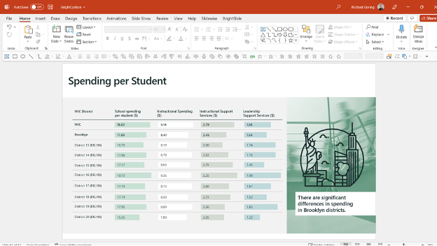
Here’s a typical example. A fairly detailed table with a load of content. Far too much to take on in one go in a presentation, and pretty hard to focus on the few things that are important.
To create the masks, draw three simple rectangles that cover the areas of the table that you don’t want to talk about. You can create as many of these rectangles as you like. The idea is to only leave the relevant pieces of information – whether that’s whole rows or columns or just a few specific points.
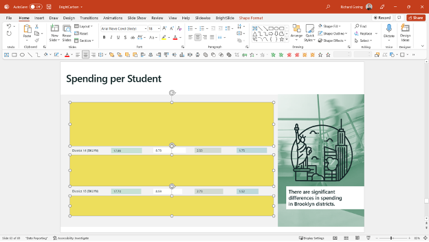
If you then change the format of the rectangles to match the background color, you can hide everything except the relevant information. But that looks a bit odd. You end up with bits of content floating around the slide and no context for what it means. So, I generally prefer to create a transparency mask:
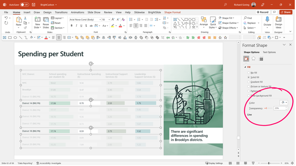
Right-click the rectangle masks and choose Format Object from the pop-up menu
That will bring up the Format Shape pane on the right
Change the Solid fill color to match the background (or use white)
Add a Transparency to the shape
Generally, something between 20-25% works well to fade out the majority of the content just enough so that the focus is still on what you want, but those key pieces of content have the right amount of context.
The beauty of this technique is that it gives you all the benefits of audience control you get from pacing the flow of information with animations while also allowing you to show complex/detailed content. It focuses your audience’s attention on the same thing, at the same time, ensuring a shared experience. And it’s really quick and easy to do. As with most things you can take it further, with more complex masking effects in PowerPoint. But you don’t need to. This works really well, and your audience will thank you for making the presentation clear, compelling, and memorable in all the right ways.
Richard Goring is a Director at BrightCarbon, the specialist presentation and eLearning agency. He enjoys helping people create engaging content and communicate effectively using visuals, diagrams, and animated sequences that explain and reinforce the key points, which is supported by plenty of resources and tips at www.brightcarbon.com.
The information given was precise and very helpful. These are things that were considered, but never put into form due to uncertainty. Now it makes sense. Thank You.
We’re glad you found the post helpful. Thanks for your comment.


2 Responses
The information given was precise and very helpful. These are things that were considered, but never put into form due to uncertainty. Now it makes sense. Thank You.
We’re glad you found the post helpful. Thanks for your comment.