


Log In
View Upcoming Events

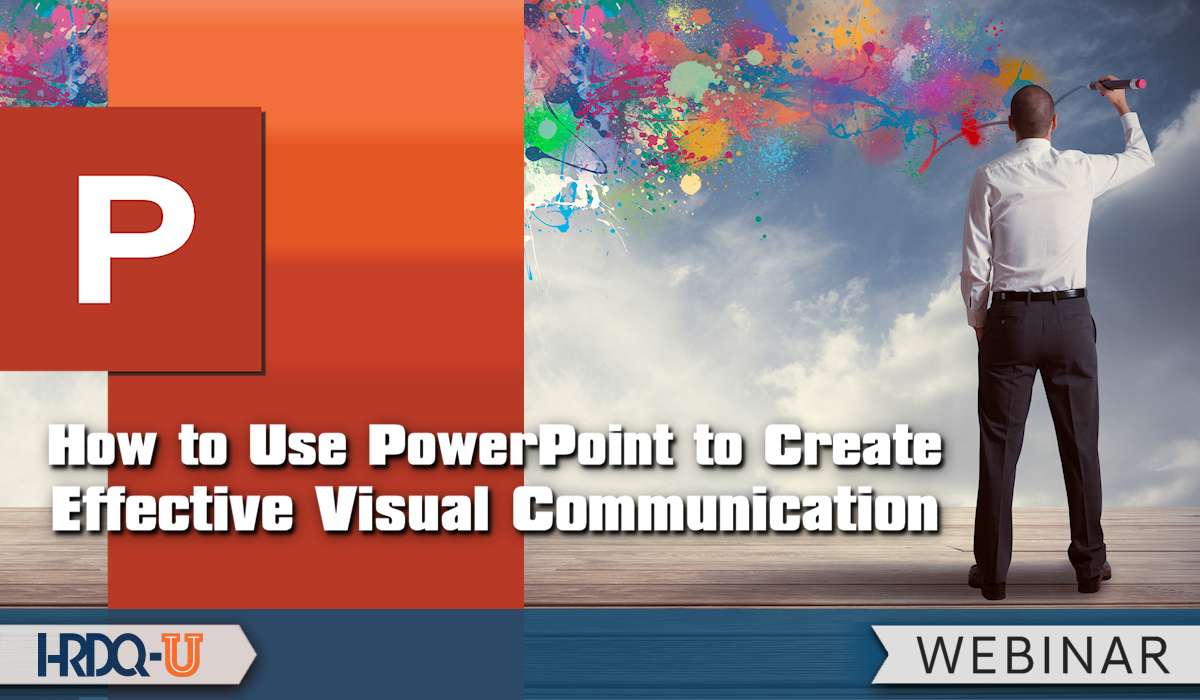
I’m joined by Richard Goring, an expert in presentation design, to discuss his recent webinar, How to Use PowerPoint to Create Effective Visual Communication. This session is perfect for anyone looking to elevate their presentation game by crafting slides that not only look great but also communicate ideas effectively. We also explore the effectiveness of a PowerPoint presentation and how to enhance it through strategic design choices.
Richard shares the key takeaways from the webinar, starting with how storytelling can transform a presentation from mundane to memorable. He explains how visuals play a vital role in supporting a compelling narrative, helping your audience connect with your message on a deeper level. We also discuss the common mistakes people make when designing slides – such as overloading them with text – and how to avoid them.
If you’ve ever wondered how to make your slides stand out, Richard offers actionable tips you can implement immediately to improve your presentations’ visual impact. He also highlights underutilized features in PowerPoint that can save time and create professional-quality visuals, even if you’re not a designer.
Finally, we delve into the “less is more” philosophy, discussing how simplicity in slide design can lead to greater clarity and engagement. Understanding the effectiveness of a PowerPoint presentation is key to making an impact. Whether you’re an educator, a trainer, or a business professional, this episode is packed with insights to help you communicate your ideas more powerfully through PowerPoint.
00:01
Welcome to this week’s episode of the HRDQ-U In Review podcast, where we bring you the latest insights and practical tools for enhancing soft skills training in your organization. This podcast is brought to you by HRDQU.com, and I am your host, Sarah, Learning Events Manager at HRDQ-U. Today, I have Richard Goring joining me to discuss the webinar, How to Use PowerPoint to Create Effective Visual Communication. Richard, thanks so much for joining me today on the podcast. Thanks so much, Sarah. Really appreciate it.
00:29
Now, Richard, you have been a regular presenter here at HRDQ-U for quite some time now, and you have joined me here on the podcast before. But can you share for those new listeners a little bit about who you are and what you do? Yeah, sure. My name is Richard Coring. I work for a presentation design agency, an e-learning agency called Bright Carbon. And we’re all about creating more effective visual communication content. So presentations, e-learning, animations, all of that kind of stuff.
00:58
And we love to share cool things, hence doing the webinars and podcasts with you. And we live in such a rapid changing environment these days. What changes do you see happening in the L&D space right now? I mean, I think still it’s all AI and automation and stuff like that, like it’s very much continuing on from last year. I think right now we’ve kind of got over that.
01:24
initial excitement of it. And so it’s trying to find specific use cases and trying to blend it together with what you’re doing. I think there’s the realization that AI is not going to take over and it’s not going to do it all. It’s not going to be that kind of magic button. And so we’re seeing lots of people doing things like generating specific prompts, like the idea of coming up with a particular prompt that will get an AI to do something for you.
01:51
is really important. The prompt can make a huge difference. And so we’re seeing people working a lot more on that and building in time to generate the right kind of prompts. Also, we’re now getting models like Microsoft is creating agents with its co-pilot AI. it’s allowing people to get to really task specific AI tools and the ability to generate models that much more easily. So I think you’re seeing that and creating models to help solve specific problems. So it’s about
02:20
narrowing that focus to make AI that bit more useful in what you’re doing. Now, if I remember correctly from when we spoke last time, you said within your organization, using AI for your clients wasn’t as easy because of the data privacy issue. Have you since found ways that you guys do incorporate the use of AI or any helpful tools that you’ve been able to use to improve efficiency or anything like that within your organization?
02:49
Yeah, that’s right. It’s good memory. It’s still tricky because we’re a design agency. Essentially, we work with lots of organizations. So it’s having to match the client’s IT rules and stuff rather than our own. making sure that it’s very much there because it’s not our data. And so being extra cautious about that is really important. There are some areas where you can start to consider the use of AI where it’s not data specific. The AI is not accessing any content.
03:18
So one of the tools that we’re looking into is the layout of content on slides. For presentations specifically, rather than e-learning, you have organizations that have hundreds, thousands, tens of thousands of slides sometimes, and then they go through a rebrand. And so one of the things that you could consider an AI to do is move content into a new position on slides to match that brand. And we’ve been working on a tool
03:47
that’s built into PowerPoint called Brandin, which primarily is about users accessing all of this content that’s already on brand. So they can access libraries of slides and assets and images and icons and stuff like that. And it’s all there. But as part of that, there’s a like a spell checking tool, but for the brand. And so you can click a button and will say, right, let me fix all of the issues with this. So the colors and the fonts and then positioning of content.
04:13
would be very interesting. And that’s something that you would need an AI tool to do. So it’s there already for some bits, but trying to expand that out into more general purpose. But again, it comes back to that point of solving specific problems rather than expecting it to do everything for you. Yeah, that’s really interesting. And so what exciting things is Bright Carbon working on right now? What new projects are you working on over there? That Brandon tool is pretty much what we’ve been most excited about.
04:40
We’ve recently launched it so that it’s available generally. You can go to the office store and be able to see it in there. And so now it’s accessible to kind of small groups and small teams. Previously, it’s just been a custom install at kind of an enterprise level. So it’s nice to be able to give that access kind of more broadly. Also looking at ways that you can incorporate more visual storytelling into a wider range of things as well. So we primarily focus on
05:10
visual storytelling, visual communication stuff. How can we incorporate that into other areas and bring people along on that journey to help them to communicate more effectively? And so we recently did the webinar together on how to use PowerPoint to create effective visual communication. Can you share what the key takeaways were for registrants at your event? Oh, the key takeaway there, because there was quite a lot of stuff. It was really split into two halves.
05:38
The first half was the theory about what makes an effective and an engaging story. And so it’s thinking about your audience and what they need and what you need to get across to them and the way in which you can start to construct visuals to help you convey a story that does resonate with your audience. And so I think for that, the major takeaway, and everyone knows this, but the major takeaway is think about your audience.
06:07
because although everybody knows that, the moment you open up PowerPoint, everyone forgets. Because PowerPoint says, click here to add text. And so you just start typing in all the things that you know about a topic rather than spending that time upfront filtering it. And it’s extremely difficult to take yourself out of that kind of practice there. So I think the first half should really be about thinking about your audience and what is going to be relevant to them that you then put on the slides.
06:35
And the second half of it was then once you know what you want to say, how do you build that up with visuals? And so it’s about using the tools that PowerPoint, for example, as a platform has available to you to help you to build up suitable content, suitable visual content that is meaningful rather than just decorative. And so the second half is really what is going to be a helpful visual here.
07:03
How can it convey your message? How can it aid the audience’s understanding of the topic or the story that you want to get across? And then Richard, what are some of the most common mistakes you see people make when creating PowerPoint presentations and how can they avoid them? Common mistakes. I suppose there are three that you see all the time, they’re fairly universal. And they largely come down to that point of
07:31
You open up PowerPoint and say, click to add text. The first is that you are overwhelming the audience with a load of stuff that they don’t really care about, or at least they don’t perceive that they care about. And that’s a huge problem because you may have a lot of really interesting content that is very relevant, but the audience doesn’t make that connection. And so they just see page after page or slide after slide of a lot of stuff and they can’t
08:00
connected to themselves. And so that missing connection is really important. There’s the classic, you know, the death by PowerPoint, the text and bullet points, all of that kind of stuff, the click through e-learning that you get. And so that’s something that still nowadays you see regularly people just putting far too much text on a slide, which is fine for like a document. Don’t get me wrong there. But in a presentation, there is someone there talking and people can’t read and listen at the same time.
08:28
And so you get this kind of interference effect going, which means that the whole thing is really dull and it switches people off, which isn’t what you want. And the third thing, which is perhaps a bit more subtle, a bit less well known, but I think is really important, is that people don’t animate their slides. They just throw everything up there all at once. And so even if you’re using a visual slide, you put it up there and most audiences, they’re bright, inquisitive, intelligent. They just can’t resist trying to understand what’s in front of them.
08:57
And so they end up trying to figure out the slide at the expense of listening to you. They can’t listen to your talking as well. And then, you you wait 15, 20 seconds or so and they figured it out. But now they’ve missed a lot of stuff that you’ve talked about. And so we’d encourage people to animate the content, just simple builds, know, simple phage animations or transitions to say, here’s a piece, here’s a piece, here’s a piece. And if nothing else, that’ll have a huge improvement on your ability to engage with people.
09:25
And can you share one or two simple actionable tips that can instantly improve the visual impact of a presentation? Visual impact. The classic, the one that I think you pick up from any graphic designer would be applying a grid to your presentation. Cliently grid to anything, to be honest. You might have heard of the rule of thirds from photography.
09:51
So this is about how you can compose a photograph. So you split your photo up into three columns and three rows and you can compose the focal points on one of those lines. The same is true for any piece of graphic design, especially presentations, but you don’t have to just split it into threes. You can split it into any number. 12 is a common number. So 12 columns of content on a presentation, because that gives you lot of flexibility. can group those, chunk those,
10:20
12 columns into one large column, two, three, four, six, 12. It gives you a lot of flexibility on any individual slide, but it also means that from slide to slide to slide to slide in a presentation, the whole thing is really consistent. So applying a consistent grid just helps things to look so much nicer, so much slicker and more professional. And if you look at any piece of graphic design type stuff, any kind of visual thing that you like the look of,
10:49
almost certain that you’ll find a good grid structure underlying it. think another one that is very hard to do sometimes in PowerPoint depends on your brand and stuff, but try to have a limited color palette. So often people use loads of different colors and sometimes if you’ve got the brand, you you can do it, that’s fine. But generally speaking, limiting the number of colors that you’re using is going to help you.
11:19
It means that things aren’t overwhelming. It means that you can use color appropriately to help focus attention on the bits that are important. It means that it doesn’t look like a big old pile of lots of different elements. You’ve carefully considered what you want to do. And so if you’ve got a brand palette with maybe six different colors, 10 different colors or something, try to just use one or two on a slide. And you can do
11:49
different colors on another slide if you want, or ideally a different section of the presentation, you can have colors for different topics that can work out quite nicely. But a limited color palette can often be extremely helpful. And are there any tools or features in PowerPoint that are underutilized but can make a big difference in creating effective visuals? Oh, yeah. In fact, it comes back to that idea of the grid. The alignment and distribution tools in PowerPoint, I think, are so important when you’re creating slides.
12:18
PowerPoint has the ability for you to select multiple objects in it and you can line them all up relative to each other. The problem is, and if you’re familiar with PowerPoint, I’ll describe the UIT so you can follow along, they’re hidden. You have to go to the Home tab in the ribbon and then to the Arrange button, which is a little yellow and white box thing. And then that brings up a submenu. And then you have to go down to something called Align. And that brings up another submenu where you’ve then got these tools that allow you to line things up.
12:47
And I just, find it bizarre that it’s hidden away in a sub menu of a sub menu of a sub menu, but they are so helpful to make sure that the presentation, the slide is, is neat and tidy and ordered. Not only do the alignment tools allow you to follow that grid structure, which is if you set it up, just means that the whole thing can work really well. But it means that even without that, things are misaligned. They’re not kind of out of place. And the number of times I’ve worked with executives that seem to get triggered, they focus on
13:16
things that are misaligned, are kind of out of joint. it’s just, maybe there’s a perception that if you’ve not been able to line things up, know, something as simple as that, then maybe the content isn’t very good. And executives are typically time poor. So maybe that’s a really good indicator to them. But if things are nice and neatly aligned and presented professionally, well, then maybe you’ve taken the same level of care and attention to the rest of the content. And so kind of it’s good. And it just
13:44
It astounds me how often you see that scenario where the focus is on seemingly trivial things and yet it can make such a huge difference. So the alignment tools in PowerPoint are absolutely worth getting familiar with. And I’d like to talk about storytelling a bit. A common theme I’ve noticed in many of your, in the webinar events that you’ve presented with us is storytelling. So what role does storytelling play in creating a compelling PowerPoint presentation and how can visuals support that narrative?
14:14
Well, mean, storytelling is what it’s all about, isn’t it? PowerPoint or presentations are a medium for you to tell a story, but you can absolutely do things in a different way. You’re communicating via email. can communicate via audio, like a podcast or just a conversation like we’re doing now. Your purpose as a communicator is to communicate something in some way. And so the story that you’re telling is vital to help you to do that.
14:41
Now, in order to think about the storytelling, you need to think about a few components that are really important. I mentioned before about the audience. Think really carefully, just for a minute or two upfront, before you start anything at all, who is your audience for this presentation? Because the story you tell can vary quite dramatically based on who that person is. If they are a new intern, there’s no point in going through a high level kind of overview, strategic overview.
15:10
If you’re speaking to the CEO, there’s no point in going into fine detail, granular stuff for three hours because they’re not going to respond to that very well. So thinking very carefully about your audience is critical.
15:24
You also need to think really carefully about what it is you want to do. Why are you telling this story? What’s the purpose of it? So what is your objective for this story, for this presentation? And how does that tie to your audience? And then critically, how does it tie to the call to action you’re going to get your audience to do? What is it you are trying to get them to do as a result of all of this? What behavior change are you trying to encourage?
15:51
And if you can think through those points and plan them out ahead of time for your audience, your objective and your call to action, then any content you create, slide content, can help you to focus on one of those things to bring it to life.
16:09
And that’s where the visual come in. So your visuals are about making it really relevant to your audience. This is why it’s important. Your visuals are about showing contrast. This is the improvement that it will take, or this is the difference that it will make. Your visuals are about helping people to understand why this is important, what they should be doing, the impact that it will have on them personally, or for the team, or for the organization, or whatever that is. And again, point that I made earlier about animations,
16:39
Animations are great because they help to pace the flow of information. You’re not throwing everything all at once to people. You’re instead saying, here’s a piece, you can understand it. Here’s another piece, you can understand it and so on. So you’re guiding your audience through so it becomes really clear and you’re taking them on the journey of that story. And what about the concept of less is more? You touched on this a bit earlier, but how does the concept of less is more play into designing slides that are both visually appealing, but also effective for communication?
17:09
It’s really important, but it’s also worth saying that when people say less is more, that doesn’t mean you need to cut out content necessarily. It’s not about dumbing things down because sometimes you need to have really complex, really detailed, really technical discussions with people. And that’s totally fine. Not everything is, you know, three buzzwords and that’s it. But if you can give people just enough and to be able to understand the ideas.
17:38
as well as just enough so that it doesn’t overwhelm them, that is smaller amounts typically of content than you might do if you were to throw everything up on the screen. so, know, less is more would be fewer words on the slide. Probably in almost all instances and fewer pieces of content, probably in most instances. But that content should be the important stuff, the things that people really care about.
18:06
that the elements that will help you to tell your story. And if you can’t break it down, what kind of structure is there? What kind of hierarchy is there within that content? Can you have some things that are larger or bolder or clearer or at the top or something? And can you have other components that are supplementary points that help to build out the detail that are smaller, that are less vibrant, that are at the bottom of the slide or something like that? So you’ve got some kind of hierarchical relationship going on.
18:36
with the visual that you’re building out. And the idea of less is more is really to help people to focus on the elements of a slide that are important, the elements of a visual or story that are important, that will help to take them through the overall kind of story arc that you’re going on, rather than saying, here’s everything that I know, and now you as the audience have to pull out the bits that are important. And that’s just really difficult because people aren’t given that kind of time in a presentation environment.
19:06
So less is more is really focusing on what is important. And sometimes that’s a lot, but it’s still usually less than everything you could possibly say. And actually, it also comes to the design as well. I talked before about a limited color palette. Again, like less is more there in terms of colors, because that can help people to focus on the bits that are important rather than getting overwhelmed with so much stuff. So it’s an important concept to think about, but it doesn’t mean dumbing stuff down.
19:35
Well, thank you, Richard. And before I let you carry on with the rest of your Friday here, where can listeners go to learn more about your work? I think so. Yeah, you can go to our website, brightcarbon.com, and there’s loads of completely free resources and tutorials there that we do every Thursday. We’re on free web in our master classes covering lots of different practical things on storytelling, on visualization, on PowerPoint, Google Slides, Storyline, all of those kinds of things.
20:01
And if you want to check us out on LinkedIn, I’m pretty active on LinkedIn as are other members of the team as well. So Richard Goring or Bright Carbon, and you’ll find me and other folks from Bright Carbon there happy to chat about all of this. Well, thanks Richard for your time today. Thank you, Sarah. Have a wonderful weekend and thank you everyone. Really appreciate it. Yes. And if you have yet to watch the related webinar, we will have that linked below as well. I highly recommend that you check that out for even more information on this topic.
Listen to this podcast event at no charge with your
HRDQ-U Free Access Membership
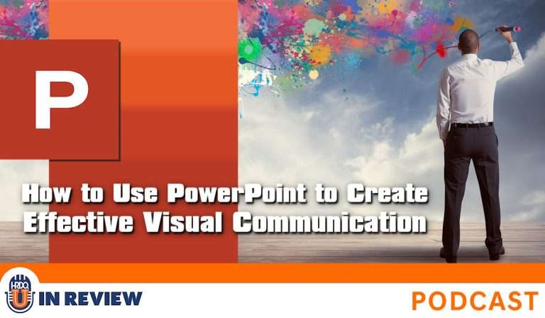
I’m joined by Richard Goring, an expert in presentation design, to discuss his recent webinar, How to Use PowerPoint to Create Effective Visual Communication. This session is perfect for anyone looking to elevate their presentation game by crafting slides that not only look great but also communicate ideas effectively. We also explore the effectiveness of a PowerPoint presentation and how to enhance it through strategic design choices.
Richard shares the key takeaways from the webinar, starting with how storytelling can transform a presentation from mundane to memorable. He explains how visuals play a vital role in supporting a compelling narrative, helping your audience connect with your message on a deeper level. We also discuss the common mistakes people make when designing slides – such as overloading them with text – and how to avoid them.
If you’ve ever wondered how to make your slides stand out, Richard offers actionable tips you can implement immediately to improve your presentations’ visual impact. He also highlights underutilized features in PowerPoint that can save time and create professional-quality visuals, even if you’re not a designer.
Finally, we delve into the “less is more” philosophy, discussing how simplicity in slide design can lead to greater clarity and engagement. Understanding the effectiveness of a PowerPoint presentation is key to making an impact. Whether you’re an educator, a trainer, or a business professional, this episode is packed with insights to help you communicate your ideas more powerfully through PowerPoint.
[ PODCAST PLAYBACK ]
You must be signed-in with your membership account to access this content.
Enjoyed this podcast? Have suggestions on how we can improve? Please take our quick survey and receive a coupon for 15% OFF any of our individual membership plans.

*Instant 15% coupon available upon completion of survey.
Want to learn more? Become an Individual or Corporate member to watch this and hundreds more webinars!
Transform your PowerPoint presentations with persuasive storytelling and these engaging visual communication techniques.

Richard Goring
Richard Goring is a Director at BrightCarbon, a presentation and eLearning agency. He enjoys helping people create engaging content and communicate effectively using visuals, diagrams, and animated sequences that explain and reinforce the key points, which is supported by plenty of resources and tips at www.brightcarbon.com.

Training Tools for Developing Great People Skills
This event is sponsored by HRDQ. For 45 years HRDQ has provided research-based, off-the-shelf soft-skills training resources for classroom, virtual, and online training. From assessments and workshops to experiential hands-on games, HRDQ helps organizations improve performance, increase job satisfaction, and more.
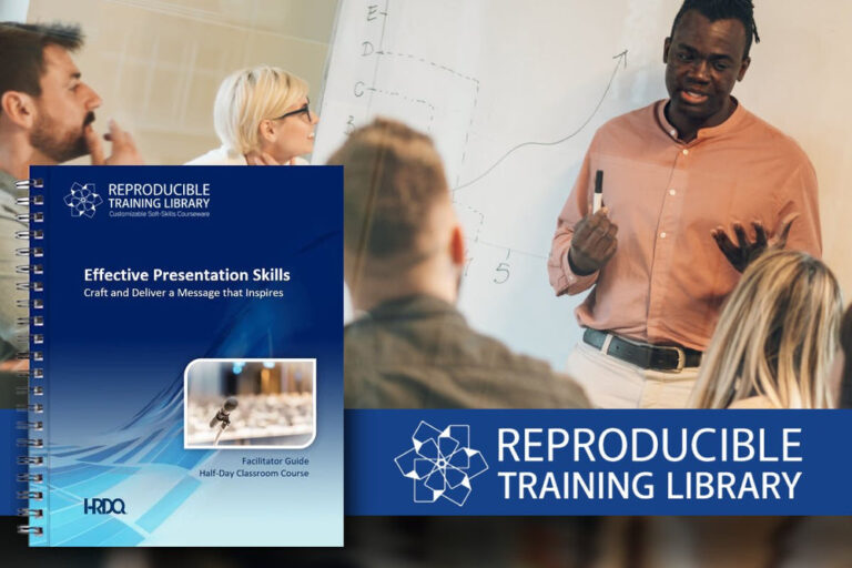
Effective Presentation Skills Customizable Courseware
Learn effective techniques for developing, organizing, and refining your presentation content to enhance its impact. You will also discover ways to project confidence and empathy, manage anxiety, and handle unexpected challenges during your presentations.
Buy at HRDQstore.com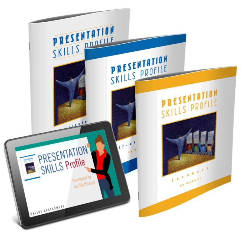
Presentation Skills Profile
Created to alleviate the anxiety that comes with public speaking, this assessment examines the way you prepare for and present your content. It offers peer feedback on a particular presentation and guides you through the process of preparation and delivery for upcoming presentations.
Buy at HRDQstore.comThe HRDQ-U In Review Podcast, brought to you by HRDQU.com, brings you the latest insights and practical tools for enhancing soft-skills training in your organization. As a learning community for trainers, coaches, consultants, managers, and anyone passionate about performance improvement, we interview subject matter experts and thought leaders from recent webinars they presented with us to take a deeper dive into the content they shared and answer all your questions. Join us as we explore new ideas and industry trends, share success stories, and discuss challenges faced by professionals.
The HRDQ-U In Review Podcast is intended for HR and training professionals, organizational development practitioners, and anyone interested in improving workplace performance and productivity.
New episodes of HRDQ-U In Review are released every week.
The length of the episodes varies, but they typically range from 15-30 minutes.
The podcast covers a wide range of topics related to HR and organizational development, including leadership development, team building, communication skills, conflict resolution, employee engagement, and more.
No, HRDQ-U In Review is completely free to listen to.
You can listen to any available HRDQ-U In Review Podcast right on our website at HRDQU.com via our embedded Spotify player on the related webinar page. In addition to our self-hosted option, you can find the HRDQ-U In Review Podcast on many of the popular streaming services, which are listed above.