If you get an all-too-familiar sinking feeling every time someone loads up a presentation, know that you’re not alone, and things can get better! And, if you’re honest with yourself, your own presentations don’t win prizes. You’re ready to be the change, but it’s hard to know where to start. If you improve the three key areas in this article, it’ll have an impressive impact on the quality of your slide design and your visual presentation storytelling.
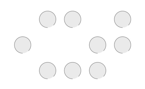
Poor Hierarchy Explained: Imagine each of these circles is a piece of information on a slide. Which did you look at first? Which seems the most important? Did you start top left, did you look to the center, or did your eyes jump from shape to shape? Visual hierarchy refers to the organization and prioritization of content as a means to communicate a message. Whether your slide design is beautiful or basic, it’s important to get the hierarchy right so your presentation storytelling is easy to follow and remember.
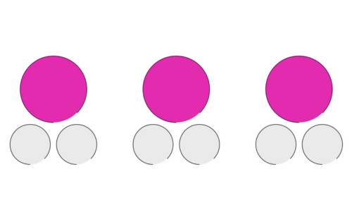
Good hierarchy example:
Good Hierarchy Explained: When you start thinking about slide hierarchy, consider how people absorb information. For example, Western cultures read left to right, so your audience will likely start reading a slide from the top left. Arranging information in a grid with the top left as a starting point will allow your audience to absorb information effortlessly. This will improve the overall presentation storytelling. Learn more about using grids in this BrightCarbon presentation design blog!
But, you don’t always have to play it safe! You can mix up your layouts as long as you give your audience visual clues showing which information is important.
Here are some of the tools you can use:
Color – Bold or contrasting colors will draw attention and infer importance. You could also use a gradient of colors to show progression.
Text Formatting – Bolding key phrases, increasing the font size, or even changing the font can work wonders to help people understand what’s important or what they should read first. Headings are often larger or in a different font, but don’t be afraid to do the same thing with a key takeaway message.
Size – Bigger objects demand more attention, so lay out your slide with the idea that bigger = more important. Consider the layout that you’re using to ensure that it all still fits within the same grid structure.
Space – Placing elements close together tells the audience that they’re related, while separating objects suggests there’s no connection. You can also use animation to show a change, with things moving apart or closer together.
Repetition/Deviation – Repetition allows you to visually group elements. Breaking that Repetition suggests to the audience that the new element is unique.
One thing to note with all of these ideas is that you should use them appropriately and not too widely. Try not to use more than two fonts in a presentation – ideally, no more than three different text sizes on the slide. And, a limited color palette (especially within a single slide) is usually the way to go for a more refined look.
2. Turn bullet points into visuals.
Bullet points are boring and ineffective. When there’s excessive text on the slide, your audience will start to read it and tune you out – you might as well stay at home and send them an email! You’re also missing an opportunity to use visuals to inform better and persuade your audience. Though at BrightCarbon, we live and breathe effective presentation storytelling, we know not everyone is as comfortable ditching bullet points for purposeful visuals as we are.
So, here’s a process you can follow to break away from text-heavy slides:
Break up your text. Split the paragraphs into sentences and the sentences into shorter sentences. Put it into bullet points if you need to (just as a means to an end).
Lose as many words as you can. Be brutal with your work, cut out the fluff, and only keep essential information on the slide – things that are relevant to the audience and help you achieve your objective. Remember, your slides will be presented, not read – the presenter can fill in the details. If you’re feeling nervous, drop all the text into the speaker notes so you have the comfort of being able to refer to it whenever you need to.
Chunk the content. Pop the remaining text into boxes, arrows, chevrons, circles – whatever’s appropriate for your message – and arrange them on your slide using your new hierarchy skills.
Use imagery. Swap as many of the text boxes as you can for graphics, images, or icons. Ideally, your images will speak for themselves, but if they don’t, add labels. In one simple step, you’ve made your presentation look much better and made it easier for the audience to take in.
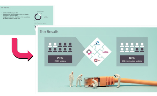
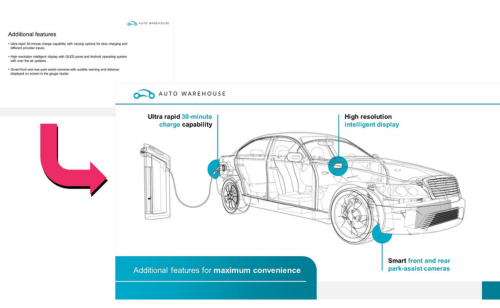
Bullet points into visuals example:
3. Animate with purpose.
Finally, add animation. PowerPoint animations have a bad rep – and for a good reason, too. We all had enough funky transitions about ten years ago. However, used intentionally, animation can help you tell your story. Builds help pace the flow of information, so you’re in control of what the audience sees when, and they can’t skip ahead and ruin the punchline. Animation also ensures that everyone is looking at the same thing at the same time – having a shared experience. This is particularly useful with graphs and charts. You can bring in each important data point in turn, speak to it in your own time, and prevent the audience from drawing their own conclusions before you’ve got to the end of the slide to improve presentation storytelling.
Animations can also be effective for presentation storytelling or signaling a change from one state to another.
For example:
Shrinking or growing icons.
Using motion paths to move elements from one place to another.
Replacing one element with another.
Transitioning an image from color to black and white or vice versa.
If you’re not a confident animator, check out the Animation Library in the free PowerPoint add-in on BrightSlide, and learn more about BrightSlide on BrightCarbon. It has a range of pre-built animation sequences you can add to your slide objects with just a few clicks. And that’s it! Start to tackle hierarchy, visuals, and animation, and you’re well on your way to creating presentations that people will look forward to rather than avoid!
If you’d like to see these and many other techniques in action, watch our HRDQ-U webinar on Mind-blowing PowerPoint. No, Really! for plenty of examples, a live demo, and a discussion on how to make an impact.
Richard Goring is a Director at BrightCarbon, a presentation and eLearning agency. He enjoys helping people create engaging content and communicate effectively using visuals, diagrams, and animated sequences that explain and reinforce the key points, which is supported by plenty of resources and tips.