Grid: The Foundation of Good Layout
The thing underpinning all well-laid-out slides is a grid. Being consistent with the placement of objects allows them to work together in harmony and creates a cohesive feel across the entire presentation.
The classic example is the ‘rule of thirds’ from the world of photography, where you split your subject into three columns and three rows for a well-balanced photo. This is true with slides, too, and I’d encourage you to try it. You can have more than three columns if needed, and my colleague Shee has written about advanced PowerPoint grids and guides and how to set them up, but this simple change can make a big visual impact.
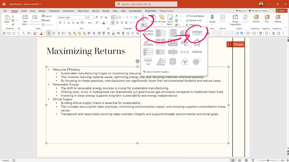
Bullet point slides can be split into columns to help the audience process the information and make it look better. It’s also really quick and easy to do. Any text box in PowerPoint can be converted to SmartArt by selecting the text box, then going to the Home tab on the Ribbon. In the Paragraph area, use the green chevron Convert to SmartArt button, and then choose the option in the top left called Horizontal Bullet List. That splits out the content into neat columns.
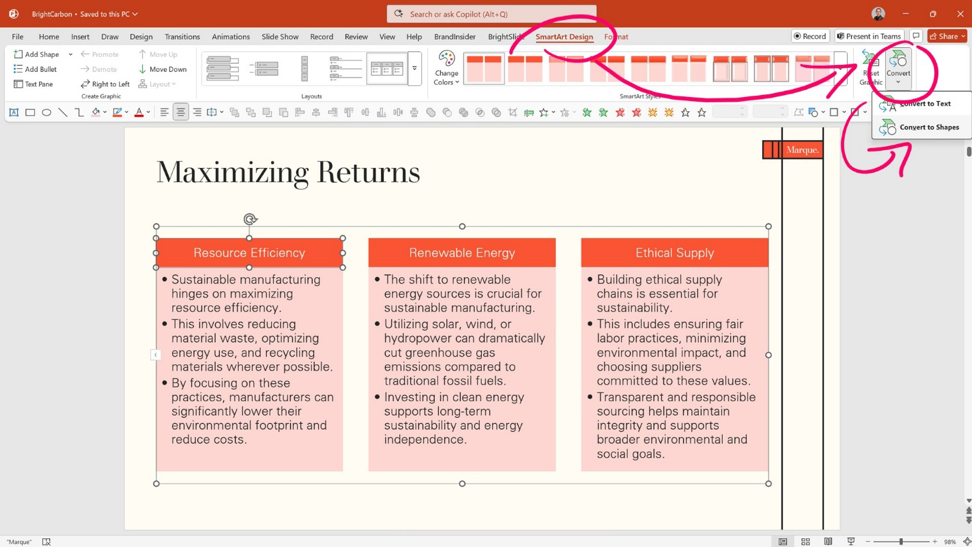
You can then adjust the formatting as you like. For greater flexibility, click on the SmartArt columns, and on the SmartArt Design tab on the Ribbon, choose Convert to Shape on the right, which breaks it into individual shapes for you to format.
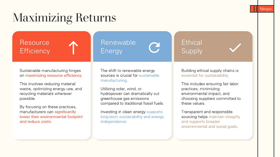
I prefer to place greater visual emphasis on the key point of any content by using more space, higher contrast, and a clear font hierarchy, as illustrated in the example. You could also change the shape, add iconography, and use color variation as additional options.
Contrast for Impact
Slide fatigue occurs when people see the same type of slide repeatedly, and most presentations use a simple white background, heading, and content. Providing variety helps break this and can allow key points to clearly stand out. It can also add an additional layer of design aesthetic so your presentation doesn’t feel like a standard PowerPoint, further addressing how to avoid Death by PowerPoint.
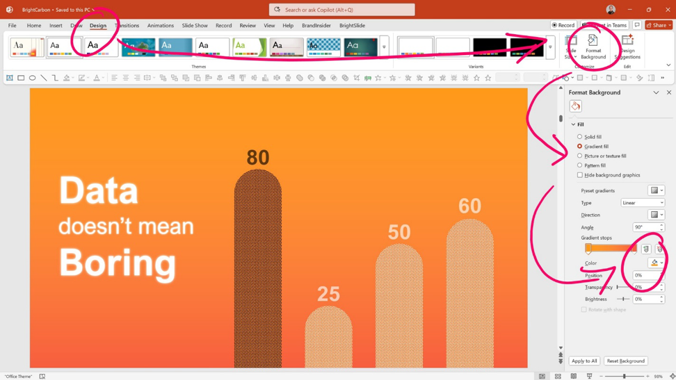
You can change the background color of a slide by right-clicking on a blank part of the slide and selecting Format Background from the menu, or going to the View tab on the Ribbon and selecting Format Background on the right. Use the Format Background pane on the right to choose a contrasting (but on-brand) color. If appropriate, you can even apply a gradient to the background for a richer feel.
The contrast doesn’t have to be limited to the background. Enhancing standard content with a contrasting color can make it stand out and can be used to emphasize specific points on a slide, too.
Beautiful Imagery
A picture is worth a thousand words, and if you’ve used a poor quality, low-resolution, miserable piece of clipart, then all of those thousand words are bad ones, and it reflects poorly on your story.
Beautiful, high-quality images are essential to convey the right impression. Sites like Unsplash, Pexels, and Pixabay are full of amazing imagery that you can download and use for free in your presentations. PowerPoint has a huge catalogue built into it, too (Insert > Pictures > Stock Images).

Images make a dramatic visual impact when they fill the screen – the term ‘full bleed’ is often used – and a quick way to do this is to use the Format Background approach from earlier, but this time choose the Picture or texture fill option and add an image.
This crops the image to the right size without distorting it, and sends it behind everything else, so your title, content, and slide master elements are all still intact, while giving you a rich background on which to build content.

Choosing the right kind of image, with an off-center focal point that gives you space for your content, is a neat technique, as it can be built around the image.

Or use imagery as part of your storytelling, finding something that not only generally represents the topic, but that can be annotated, highlighted, or manipulated to be able to communicate the idea clearly and elegantly.
Share with BrandIn
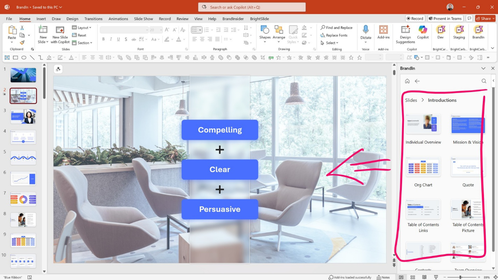
Once you’ve created a series of impactful and effective slides, you can help others in your team by sharing them to promote best practices and a consistent style in all your presentations. The BrandIn add-in for PowerPoint and Word enables you to upload slides, images, icons, and graphics, and share them with your team, department, or entire organization. This allows them to quickly and easily create their own on-brand presentations and documents.
Be Consistent
There are a great many options available, so I would recommend that you choose a small subset and then be consistent across all your slides and presentations. Too much is too much. Use the same grid structure throughout, select a single color for emphasis and use it sparingly, and treat images in the same way each time. This results in more impactful, elegant presentations that will show your ideas in the best light.
If you’d like to learn more about how to avoid Death by PowerPoint with effective slide design, I will showcase different approaches to Quickly Create Clear and Professional Slide Layouts in PowerPoint in my webinar. There’ll be loads of live demos showing you how to do it and plenty of variety to pick from.