What if a law were passed prohibiting bullet points from exceeding three words in length? Could you abide by it? Perhaps not, but humor me on this one, because it stands as one of the best exercises you can undertake, whether you are the presenter, the content creator, or both.
This chapter represents my stock in trade, as I have been advocating for this technique for nearly 20 years. If you have attended one of my webinars, chances are excellent you have heard me discuss this challenge. It is no less relevant in virtual. In fact, you could make a strong case that it is more important for virtual presenters to place their slides on a text diet.
This chapter represents a lesson in futility: you will see shortly that the exercise that you and I will undergo together is doomed to failure. But from this failure can emerge extraordinary successes. From this failure, you might unlock the secret to better presentation design.
Recommended event from HRDQ-U
Want to learn more? Watch a webinar or join a workshop on this topic.
Say Farewell to Death by PowerPoint Once and for All
Avoid the dangers of death by PowerPoint. Learn how to create presentations that capture attention and inspire audiences.
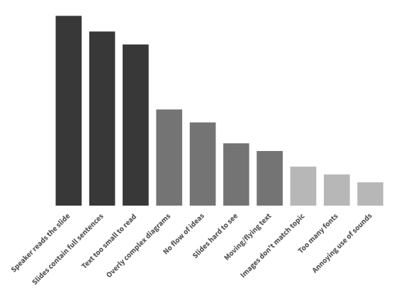
My friend and colleague Dave Paradi (ThinkOutsideTheSlide.com) conducts a bi-annual poll, in which he asks a simple question: What annoys you the most about PowerPoint? Across a decade of data, there are three responses that have clearly outpaced all others:
To summarize, people don’t like when speakers read verbatim slides that contain complete sentences of tiny text.
Whew, talk about a tale of woe. And what do these three traits have in common? They are all symptomatic of slides that are overladen with text. In my virtual travels, where I am able to interact with presentation builders from all six of the inhabited continents, I see it all the time. In spite of research that clearly shows that audience members hate when we do it, we continue to do it. We place too much text on our slides, resulting in reduced appreciation for the message, in turn causing confusion and resentment.
Breakfast Gets a Makeover
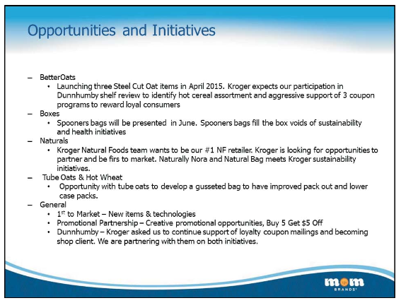
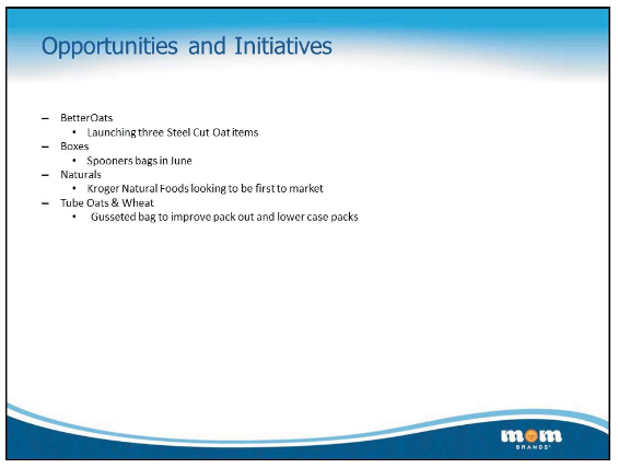
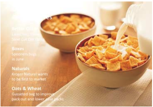
MOM Brands has been one of the most prominent makers of breakfast cereal for decades. Getting its name from the legendary Malt-O-Meal16 Part One: Get Visual hot cereal, Post Foods bought MOM in 2015 for $1.15B. Everyone eats breakfast and competition is white hot for a stake in this business. MOM competes earnestly in that marketplace and brought me in for slide review a few years ago. Big or small, it seems that all companies must fight the urge to run off at the mouth with slide content. Here was one such example:
Drowning in text In wanting to find partners in the competitive breakfast food industry, MOM Brands got a bit lost on its story. Can you spot the type? It’s hard with all that flotsam.
While on site with the team that produced this deck, we were all treated to a rousing example of Universal Axiom No. 2: “If you display complete sentences on screen, it is practically impossible to avoid reading it word for word.” I asked one of the team members to stand up and pretend to be the presenter, speaking to the first bullet point.
He almost became paralyzed. It was tremendously challenging for him to make even the slightest change in the sentence construction and the experience rendered him a mere drone. This is why the fire danger is so high in creating slides with fully-formed thoughts. Let’s go inside the head of a typical audience member when you become a drone in front of a slide with this much text on it:
Wow, is he really going to recite all of that to me…I can read it faster than he can say it…I’m already done…why didn’t he just email it to me…what am I even doing here…I think I’ll just text my friends.
That’s pretty much how things go when audiences are subjected to slides like this one. So I want to challenge you. As the name of this chapter foretells, I call it my Three-Word Challenge, and it has acted as my mantra for nearly 20 years:
Can you reduce every one of your bullet points to three words or fewer?
That might be very difficult for you to do; in fact, it might be an impossible task to accomplish. But you have to try nonetheless, as I’m going to now with that infamous MOM slide:
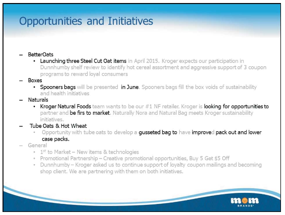
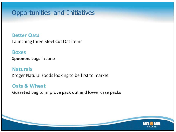
Removing the flotsam The grayed-out words represent the ones deemed to be unnecessary for the slide. Spot the typo yet? When scrutinizing the text to this degree, it’s easier.
You’ll note that I failed just about every time. Except for the final bullet, where I suggested total removal, not once did I actually get to three words. But I assure you that the reward is in the attempt, because look where the slide is now:
Were I to go no further at all, this slide would be a better experience for everyone attending the webinar. Of course, now we can go further, and perhaps that’s the whole point. To those people who declare themselves to be bad graphic designers, who really knows what your instincts might be with respect to slide design, as most slides afford you no opportunity to find out. The finest designer in the world would not have been able to save the original slide.
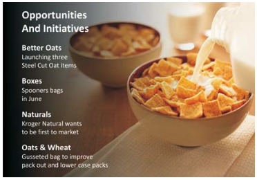
But now, perhaps for the first time, you have an opportunity to think like a slide designer, and it might become apparent that you shouldn’t have bullets with only one item and that this list would be better as subheads with trailing lines of text:
Much better It would be perfectly appropriate to declare this slide done (with typo found and fixed). But could you do better still?
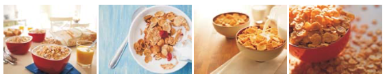
But let’s keep going. Now that you can think like a slide designer, I would want you to have the following thought process: Can I find a photo that is evocative of the breakfast experience, and if so, can I size it up to fill the entire slide? I’m pleased to report that no degree in the arts is required for such endeavors. Head to your favorite stock photo house, or use PowerPoint’s built-in image search, and have at it. It was crazy how many candidates I found in about 90 seconds of browsing:
These photos all share a particular quality and I wonder if you might be able to guess it before reading further. They all have areas of the image that could be obscured by text without losing impact – white space, as it’s commonly known.
And because we have honed and distilled our text, it can fit into that white space. Here are the steps to finish this slide:
1. Choose one photo, discard the rest, and size it up to fit the slide, cropping the photo if necessary. Make sure to start with a photo that is at least 800×600 in size to ensure that it still looks sharp when sized up to fill the slide.
2. Place the MOM branding along the bottom. I rarely think this is necessary but my clients usually do and I don’t consider that fight worth waging. However, I did dig in my heels about a straight bar replacing the wavy one. It’s cleaner, more professional looking, and less susceptible to having its space violated by the elements of a busy slide. As you can see, there is lots of open space at left.
White space to the rescue This becomes the backdrop for our content, with a healthy swath of space on the left side of the photo.
3. Now place the text in that space and set it to be white. You might be alarmed by the result, which is obviously not yet ready for prime time. A slide with unreadable text is the worst form of Death by PowerPoint.
Halfway through…ouch Placing the text over top this photo would be a fail, but we’re not done yet…
It is now time for one of my favorite PowerPoint tricks, mentioned in Chapter 1: the semi-transparent shape. I find these simple objects – they’re usually just rectangles – to be fantastic for solving problems and creating contrast and readability. They can make you look way more talented than you might be. (No surprise that I use them all the time.)
4. Create a rectangle that spans the entire vertical length of the slide and about 2/3s of the width. This rectangle is to have a specific gradient fill pattern running from 100% opaque black on the left side to 100% transparent black on the right side.
The opaque part of the rectangle provides great contrast and then the transparent part of it allows it to simply fade away. When you blend simple text with large, relevant photos, you create slides that distinguish you from just about everyone else using PowerPoint.
Now we’re talking Plenty of contrast and readability and a nice, clean slide.Watch a demo of this technique here
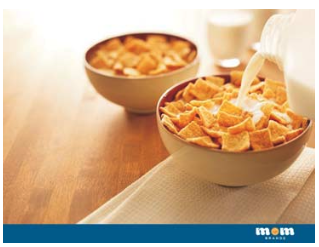
But as good as this looked, I wasn’t satisfied. I really wanted to see some humans in the photo, so I kept looking, and found this gem:
What a perfect breakfast photo! The white space is on the other side, but that is no issue at all. I performed the same maneuver in reverse, noodled on the title a bit, and found nirvana, which you can see on the next page.
Watch a demo of this technique here.
Voilà
Download mom-brands.pptx to watch this sequence and to study how these slides were built.
The before and after for this slide is dramatic, as will be the high regard that your audiences will hold you in when they see it.
The Rewards of Three Words
Several important things take place when you make an earnest attempt to hone and distill your slide text. And as the previous exercise shows, you don’t have to actually succeed at the Three-Word Challenge – that’s practically impossible.
Your Slides Are Friendlier
With just that one task, you create slides that are much easier on the eyes of your audience. Eye fatigue is the silent killer of presentations. When you ask your audience to sit in front of their monitor for 30 or 60 minutes, their eyes are going to be the first to check out. The more words each slide contains, the quicker the onset of visual fatigue. Fewer words, less fatigue. Your bullets might not be as descriptive, but that’s a good thing: it’s your job to do the describing.
Your Pace Improves
Something almost magical happens when you reduce the amount of words on a slide. Everything seems snappier, audience members become more receptive, and you most likely project more energy. The entire experience feels more lively and upbeat.
You Create Intrigue
In three words, you cannot fully explain your points. But that’s not bad; it’s good. In fact, it’s terrific! Unburdened from all that describing, you will become a better writer of bullets. You will begin to write with verve and color. All of this will help you reach audience members emotionally. And that, dear reader, is the holy grail of presenting.
You Learn Your Material Better
Of the many bad things associated with dumping complete sentences onto slides, perhaps the worst is how lazy it makes everyone, from designer to creator to presenter. Excess verbiage sends a subtle but powerful message that you don’t need to prepare as much, because everything you want to say is already there. It is almost scary how many rounds of review and for how many months that typo in the original slide went undetected.
Parsing the words increases your burden as a presenter, but once again, this is a noble burden. Adhering to the three-word rule forces you to learn your content at a level you otherwise might not have reached.
As for all of that text that was eliminated from the slide? The next chapter suggests a better home for it.
Of the many quotes mis-attributed to Mark Twain, here is one of my favorites:
“If you want me to speak for an hour, I am ready today. If you want me to speak for 10 minutes, it will take me two weeks to prepare.”
The Three-Word Challenge is a microcosm of the wonderful dynamic that Twain was said to have articulated. In order to get down to three words, you really need to study the text. You need to truly understand what you intend to communicate and you need to pick three words that best represent each idea. Getting down to three words requires that you practically get intimate with your text.
In the case of bullets, less is so much more. Taking the Three-Word Challenge is one of the best devices to get you to less. It took four passes and over 45 minutes to hone the MOM text. Mark Twain would have been proud.
Copilot vs. ChatGPT vs. Human: The Battle of the Bullets
If ever there were a task that can and should be delegated to a non-humanoid, it would be the cleaning up of dreadful bullet slides. So let’s ask and answer the question: Can this task of shortening bullets be given over to AI? And if so, which service does the better job?
The Patient
Here are four bullet points from an actual slide, exploring if and when a department should hold meetings:
If topics can wait until a recurring session/meeting, refining call, then we should discuss adding the topic to a regularly scheduled meeting
If we need a very specific group of people to address a topic/theme and we think the topic/theme won’t benefit the entire team and/or will take a lot of time to discuss (30-60 minutes) then we carve out a separate meeting
Be specific in title of meeting (what is the topic and goal of the meeting, what area of work is this meeting supporting, include details in the meeting invite, etc.)
Don’t end the meeting without agreeing to the next steps: Was there a resolution? Action items? Who is responsible for communicating the decision? Who is responsible for the action items and when will they be complete? How will we communicate the result of the action items?
By any measure, these are dreadful. Complete sentences, parenthetical thoughts, numerous filler words – everything we associate with Death by PowerPoint. Writing this before actually knowing the results, I would be certain that all three agents –human, Copilot, and ChatGPT – could improve upon this trainwreck. Let’s dive in…
The Human: Nuance Is the Secret Sauce
I went first so as to not be influenced by anything that the AI engines might have done, and my conclusion is that these bullets did not need to have a question-and-answer rhythm. All they really needed to do was pose the key questions that make up the set of criteria. The presenter should be the one to provide the answer: yes, we should call a meeting; or no, we should not. So here is my rendition of the bullets:
Can the topics wait?
Need specific people?
Agree on next steps?
Identify action items?
I ended up eliminating the third bullet entirely and turned the fourth bullet into two specific questions. I did this because I am a human, capable of thinking in nuance. Writing this before knowing for sure, I strongly suspect that both AI bots will tackle each bullet and just try to simplify them.
Let’s find out…
Microsoft Copilot: An Easy Experience
To turn Copilot loose on these awful bullets, I needed only click the little icon that persistently (and often annoyingly) appears next to selected text placeholders. That presents several choices, including Condense:
If a topic can wait for a regular meeting, consider adding it to the agenda of that session.
For discussions requiring specific attendees that may not benefit the entire team and could take 30-60 minutes, schedule a separate meeting.
Clearly define the meeting title, outlining the topic, goals, and relevant work area, and include details in the invite.
Conclude the meeting by confirming next steps: Were resolutions reached? What are the action items? Who will communicate decisions and complete the tasks, and when will they be done? How will the outcomes be shared?
Get Visual Copilot did simplify these slides, but not by much. And curiously, it chose to punctuate each bullet with periods, which might be justified given how verbose they are. Copilot is cumulative, however, and I could ask it to keep condensing. After four more passes, the bullets looked like this:
Include postponable topics in the regular meeting agenda.
For discussions needing a specific group, arrange a separate meeting.
Clearly state the meeting title, topic, objective, and details in the invitation.
End the meeting by summarizing next steps: decisions made, action items, responsible individuals, completion timelines, and how outcomes will be communicated.
These are noticeably better now. Not good enough, but better. And while I had to ask Copilot to condense five times to get to this result, each pass was easy to perform.
ChatGPT: Less Convenient but Worth It
Using ChatGPT required that I cut the text out of PowerPoint and paste it into one of its prompts. Here is what I said to it:
Please condense these bullets as much as you can. Use your judgment to ferret out the meaning and condense this prose however you see fit. The topic is identifying the criteria for whether or not to call a department meeting.
Then I pasted the text word for word. Here is what it produced:
If the topic can wait, add it to a recurring meeting
Create a separate meeting for focused, time-intensive discussions
Make the meeting title clear – include topic, goal, and context
Don’t end without decisions, ownership, and next steps
I was impressed – I felt as if ChatGPT used real judgment in determining the salient points. I told it to use its judgment but I was just being polite. I also said “please” – I tend to do that with mine, I don’t know why. I also have named mine. Then I asked it to return to the text and hone it a bit more. It delivered:
Use recurring meetings for routine topics
Schedule special meetings for deep dives or niche groups
Title meetings clearly with purpose and scope
End with decisions, ownership, and next steps
I then copied this text and pasted it back into PowerPoint. That extra effort was worth it, as this is now a vastly improved slide.
Verdict: I Win
Forgive the lack of modesty, but I would choose my judgment over that of any AI engine any day of the week. And we should all take delight in that: no machine can produce the nuanced thinking that we humans can, to which we should all say hallelujah! That is why AI is a fantastic research tool but not as good of a finishing tool. That is why Sky (that’s my ChatGPT’s name) has offered many ideas for this book but has not written a single word of it.
Sky did much better than Copilot, even giving Copilot five cracks at the task. But both services improved the text, and that is encouraging. Fixing bad bullets is a joyless chore, and if we can alleviate some of the pain by getting a robot to help us, more power to us.
Rick Altman has been hired by hundreds of companies, listened to by tens of thousands of professionals, and read by millions of people, all of whom seek better results with their presentation content and delivery. He covers the whole of the industry, from message crafting through presentation design, slide creation, software technique, and delivery.
He is the host of the Presentation Summit, now in its 23rd season as the most prominent learning event in the world for the presentation community.
When not in front of audiences or in the Zoom studio that used to be his daughter’s bedroom, he will invariably be found on some sports field, be it a tennis or pickleball court, a baseball diamond, or a golf course.
Check out our top-selling training materials on this topic.
Presentation Skills Profile
Speaking in front of an audience can be intimidating. This self-assessment guides you in reviewing your preparation and delivery, collecting helpful feedback from peers, and following a clear, step-by-step path to a successful presentation.


 What a perfect breakfast photo! The white space is on the other side, but that is no issue at all. I performed the same maneuver in reverse, noodled on the title a bit, and found nirvana, which you can see on the next page.
 Voilà
Voilà