
In this episode of HRDQ-U In Review, host Sarah sits down with Richard Goring, a presentation design expert from BrightCarbon, to explore what makes professional PowerPoint slide design effective and engaging.
Richard shares how presentation expectations have evolved since COVID-19, with audiences demanding higher-quality visual storytelling and the growing role of AI in content creation. Together, Sarah and Richard dive into the core principles of great PowerPoint slide design – avoiding bullet-point overload, creating clear visual hierarchy, using contrast effectively, and placing images with intention.
This conversation is full of practical tools and quick wins, from using PowerPoint’s Convert to SmartArt and morph transition features to leveraging branding tools for consistency. Richard emphasizes that slides shouldn’t just decorate – they should tell a story, meet clear objectives, and keep the audience focused with strong PowerPoint slide design practices.
Whether you’re preparing for a big pitch, training, or executive presentation, this episode will help you master PowerPoint slide design that stands out and connects.
Special Offer
Sick of off-brand slides and wasted time on content creation? Meet BrandIn – a tool that puts your brand kit, templates, and image libraries right inside PowerPoint and Word via SharePoint. No third-party hosting, no delays – just fast, on-brand content at everyone’s fingertips.
As a bonus, get 10 months free in the BrandIn Insider Programme with exclusive training, early feature releases, and special product drops.
Chapters
Action Items for Listeners
00:01
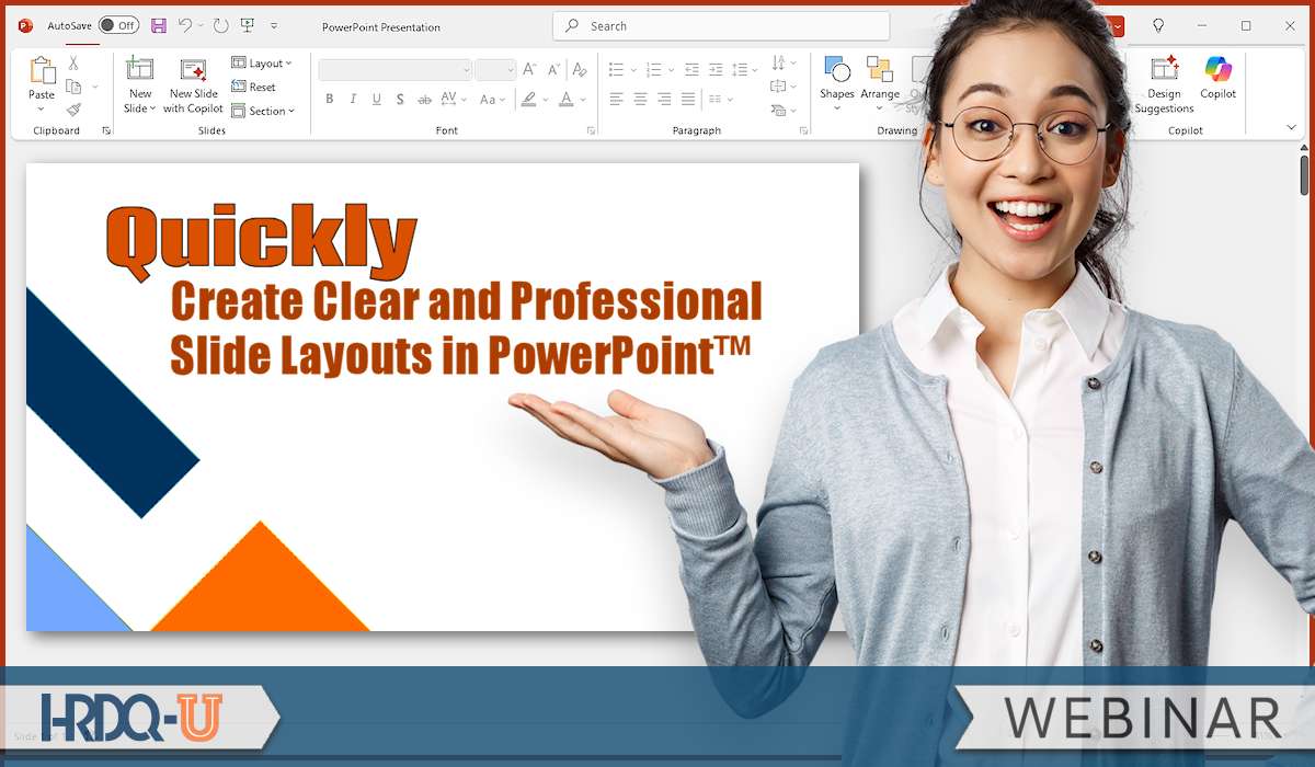
Welcome to this week’s episode of the HRDQ-U In Review podcast, where we bring you the latest insights and practical tools for enhancing soft skills training in your organization. This podcast is brought to you by HRDQU.com, and I’m your host, Sarah, Learning Events Manager here at HRDQ-U. And today, we are joined by Richard Goering to discuss the webinar, Quickly Create Clear and Professional Slide Layouts in PowerPoint.
00:25
Now before we dive in here, be sure to subscribe to our newsletter at HRDQU.com for exclusive updates, upcoming webinars, and resources to help you and your team excel. And also give us a follow and leave us a review on whatever platform you listen to your podcast. It helps us a lot and we really appreciate your support. Richard, welcome. Thanks so much for joining me today. Thank you so much, Sarah. Really appreciate you having me here. So let’s get started here. And Richard, can you share for our new audience listeners?
00:51
You’ve been here with us for a while and we probably have our regulars that love to come listen to you. But could you share a little bit about yourself and who you are and the work that you do? Yeah, sure. I work for a presentation design agency called Bright Carbon and we specialize in creating visual storytelling content for clearly things like presentations, but things that are related to it as well. So e-learning content, infographics, dynamic animation, stuff like that. And then training for folks on
01:19
how to do it all. So we get to speak with lots of people who are creating this kind of visual content, see lots of different bits and pieces around the world. And what led you to specialize in presentation design and storytelling and using PowerPoint with your clients? It’s a fascinating question that everyone in this industry always gets asked because everyone’s is different. No one of wakes up and think I want to do kind of presentation design for a career. It’s a little bit odd.
01:47
I started in it out of complete chance, as most people do, to be honest. uh I did a university degree that was very technical and thought, I’m going to try something different. Found a work experience placement doing this, just randomly thought this seems interesting. And it is because you get to speak with lots of different people, trying to say lots of different things, learn about a great many different topics and then help them to figure out the best way to communicate that out. So it really scratches lots of different itches and
02:17
frankly, people really struggle with presentations and PowerPoint and things related to it. So it’s extremely rewarding to be able to help people with that and see the impact that it can have with them. Yeah. And PowerPoint, the tool itself, I mean, I think it’s come a long way. But from your perspective, how has expectations for presentations changed in the past few years? I’m sure you see a lot in the work that you do daily with your clients. Yeah. I think
02:43
there had been two major changes really since COVID started. I think the first thing that COVID brought us from a presentation-related perspective was people expect far better from their presentations. Like we all suddenly had to go online, that was it. And so the slides had to do so much more of a heavy lifting. So we’re now seeing people expecting far better quality presentations. They need to be more visual in what they’re doing.
03:12
But also from an audience’s perspective, you want to be informed and entertained, but also not have your time wasted because you’ve been sat on presentations for hours, Teams call or Zoom call or something, and that’s just hateful, whereas you can kind of get away with it if you’re in person. And that has stuck. And so the expectation for presentations to be of better quality in a variety of different ways is really vital. And then secondly, slightly more recently, but obviously pervades everything, is AI.
03:41
And people are expecting AI to do a lot more for them in terms of the content creation, but also the delivery and the reception of presentation content as well. And I think at the moment, people are expecting it should do a lot more than it actually can. But what it can do really well is maybe help you with brainstorming on storytelling, coming up with different ideas to be able to use it as a sounding board back and forth. And also because so many presentations are actually
04:09
documents that are sent out afterwards. It’s great summarizing what’s gone on, what is important in this to be able to give you the gist of it without having to go through 30 or 40 slides. Yeah, and I think that was a common question we received in our webinar too, is people are really hoping for some type of tool, an AI tool to really help boost their PowerPoint skills with the click of a button. Now, we recently partnered together on the webinar, Quickly Create Clear and Professional Slide Layouts in PowerPoint.
04:39
So for those who couldn’t attend, what were the key takeaways that you wanted participants to leave with? I think there are a few different things that you might consider depending upon where you are at the moment with your presentations. The first is something that I think everyone recognizes immediately. Just don’t have lots of text and bullet points in your presentations. That’s really for documents. And so thinking through different ways that you can represent your content would be ideal, but don’t have bullet points.
05:07
Thinking about the layouts that you can use, having a sense of hierarchy is really important. Not only does it make things look better, but also it helps to guide your audience as to where they should be looking, what’s important, what the order of things might be. So it makes it much easier to parse and assimilate the information. There’s lots of different ways that you can create a hierarchy from very simple column structures through to building out.
05:33
different ways that the content can be on the slide, different positions the content can be to imply or impart meaning in some way. Contrast is another really important thing to consider with your layouts and presentations. Again, to draw attention, to focus something, but also to make things very easy to see. On a beautifully uh display, beautiful quality display that you have on your laptop, hierarchy or contrast might not be too important. But if you are presenting in person or it’s a
06:02
quality monitor or something, contrast is super important. And from an accessibility perspective as well, making sure that everyone can access the content, that’s critical. And then we also talked a little bit about images, not just to add some decoration, but also thinking about how you place your images on a slide, how you crop the images as well, so that you’re giving yourself space for other pieces of content and considering the focal point of the imagery. And again, the way that
06:31
the slide will be kind of viewed, what’s the scan through the slide. And then if you can really push it, can you use the layout of the slide to help enhance the story? Can you show comparisons or relationships? Can you show trends? Can you show movement or progression so that the underlying layout helps to emphasize the main point that you’re trying to get across?
06:56
And you shared many practical techniques for making slides clear and more engaging in less time. Which of those tips do you think had the biggest aha moment for our attendees? uh I think there were probably two. One was something I showed right at the start and one was something I showed right to the end. And the one at the start was really basic, really simple. So I said no bullet points. And yet most people either start off with or get given text and bullet points as their slide to start off with. it’s like, what do I do with this?
07:25
you can convert any text box in PowerPoint to a SmartArt graphic by clicking on the text box, going to the Home tab in PowerPoint, and there’s a little green button somewhere in the middle of the Home tab called Convert to SmartArt. And it instantly changes the content from regular bullet points into a process flow, a cycle, a column structure, an org chart, whatever it happens to be that’s going to be relevant. Now, it’s worth noting that SmartArt isn’t always ideal.
07:55
but it instantly transforms the slide into a different layout that then can be the starting point for you to be able to expand upon it and build things out. And I think just knowing there’s that single button there to make quite a dramatic change to your slide really quickly is a thing that people don’t realize or recognize. And it means that you can start off that much more quickly. I think related to that as well, early on I talked about using contrast for your content.
08:23
And again, that makes people realize, oh, I can create more layered, richer slides and still make them really easily visible. And actually it helps to enhance the story. So those are the start. And then the thing I showed at the end is really to try and push the boat up some more using the morph transition in PowerPoint. If you’ve never used that, would recommend that you try it out or go back and watch the recording. And morph is a transition that allows you to move seamlessly from one slide to another.
08:52
and it moves everything around. So if you wanted to show a change in some way, putting it over two slides, this is the start point, this is the end point, the morph transition will automagically kind of move between the two of them. And so it makes it really clear in a presentation exactly what’s going on, exactly how this change is occurring. And again, it’s extremely quick and easy for you to do as a content creator, as a presenter. Yeah, I thought the morph, uh
09:20
a tip that you shared was really cool. It’s definitely something that are worth checking out to see that live in action in the recording. And so what do people often get wrong about what makes a slide look professional?
09:33
There are a couple of things that you might consider here. One is they take a slide and they go, oh, I needed to make to look better. I’m going to add some visual interest and they throw a picture on there or they choose a nice font, for instance. But they miss the fundamental point of the slide, which is to tell a story or to address a question, to impart knowledge to the audience, to persuade them to do something. And it’s just about adding decoration and doesn’t do anything else.
10:01
And so I think that a professional slide for me should be an effective slide. And so being able to tell that story clearly is important and just dropping a photo or a nice font in there won’t do it. Another thing you see is that the presentations are all over the place. They’re inconsistent in terms of their brand or their style. And you’ve clearly got a uh frankendec where people have pulled together things from all over the place. It doesn’t…
10:28
really come across as being professional at all. You’ve clearly not put the time and effort into this to make sure that it works well. It doesn’t reflect well on you as an individual or the organization because brands are really important actually and you put a lot of effort into a brand because it helps to give you a sense of credibility and expertise right from the outset. I think some of the things that you should look at to avoid that are to go through and
10:58
Every slide that you have, ask yourself simply, so what? What is the point of this? Can I convey that really clearly? And if your presentation is also gonna be a document that you’re sharing afterwards as well, not best practice, but I recognize that sometimes you need to do it, does the title perhaps give you a clear sense of what it’s about? Or is there a very obvious call out that says, this is why this matters? And I think that’s really important. And from a consistency and a branding perspective,
11:27
Actually, think we talked about this in the webinar too. There’s a wonderful little keyboard shortcut that can help you with this, which is called Pick Up and Apply Style. Don’t have your content kind of mismatched all over the place. Find a style that you like the look of, select that object and use the keyboard shortcut Control and Shift and C. And that will pick up the formatting, the style from that object. And then as you’re going through the rest of the deck and you’re addressing whether or not
11:56
this does help to answer a question. Anything that seems off in terms of the style, select it and use Control and Shift and V, and it will paste all of that formatting on to make it consistent. And just maybe as a shameless plug, sorry, uh we have an add-in for PowerPoint called Brand-in. We talked about this briefly on the webinar as well. Brand-in is a tool that allows you to create all of the content that you want or your branding team to create all the content you want.
12:26
and then share that with everyone across the organization. So they have a library of slides and layouts and images and iconography and templates that mean that they can create content really quickly. It’s just that they’re in PowerPoint and they can pick and choose the bits and pieces they want very simply so that when you are creating content and you are adjusting it, again, it’s going to be consistent in what you’re doing.
12:49
Now, when you’re working under time pressure, how can presenters design slides efficiently without sacrificing quality? The perennial question. Yes, I’ve got loads of time to make this presentation, said no one ever. It it doesn’t happen, does it? I think a lot of people feel pressure to make a slide for everything they want to say and for those slides to be completely comprehensive. Just remember, this is a presentation which means
13:18
pretty much all of the time there is going to be a presenter, maybe you there talking over the top of it. It’s not necessarily a document. So it doesn’t need to cover every single last thing because you can also say it. mean, a classic example of this is people have a slide that says, this is an introduction to me and they’ve written bullet points about themselves and it’s just, it’s not necessary to do. So it could be, this might be a cop out, but it could be that you don’t need slides for everything.
13:48
But let’s imagine you do, because it’s also a document there too. I want you to think really carefully upfront about every slide. What is your objective for this presentation, this sequence, this slide? Who is your audience for it? And what action do you want them to take as a result? And if you can address the objective you have for this specific audience, for the action you want them to make this successful,
14:16
you can usually help to refine the amount of content you need on the slide quite dramatically. So it limits the amount that you need to put on the pressure that you feel to add everything you know. And that can help to reduce the amount of time it takes to create stuff. Now that might be a little bit unfair because you’re asking for what’s a quick trick to make a slide more quickly, but I do genuinely think that helps to reduce the amount of content you need to create in the first place. But a quick trick,
14:45
is actually going back to the smart art thing that I mentioned just before. If you start off with a lot of bullet points, either this is your thought process when you’re storyboarding something out or someone else has given you the slide, how can you make something that just looks that much better that much more quickly? A bullet point layout looks pretty terrible because we’ve all seen them. It’s really boring. It’s slide fatigue with slide after slide of bullet points. Changing it into a column based structure
15:15
helps to break that up. It also helps to chunk the content more easily and it just looks a lot nicer. So if you select your bullet point slide and you go to the home tab and that little convert to smart art button, the green Chevron button there, when you click it, there’s a few options that appear. And on the top right hand corner, there’s a type of smart art called horizontal bullet list.
15:40
And if you click on that, it converts your regular bullet points into a column structure across the slide. And it also gives you hierarchy and contrast in there as well if you’ve got sub bullets. And it’s just, again, a one click way to really quickly transform the slide. And we covered that in the webinar. You can then take it further. You can then do modifications and things to it. So I’d encourage you to check out the recording to see what else you can do. But that’s a nice little quick win kind of thing.
16:07
And what are some common mistakes you see presenters make when creating slides and how can they avoid them? Oh, right. This is extremely reductive, but I do think it’s true. Now, as I said, I work for a presentation design agency, Carbon, and we see thousands of presentations all the time, every year. There are, I think, three really common mistakes that you see. First relates a little bit to that previous point about the objective.
16:37
People put everything they want to say on the slide without necessarily thinking, how does this relate to the audience or the objective that you have? And it’s the classic, just me, me, me, me, me, me, me, kind of everything going on there, which is really boring, frankly. It doesn’t engage people. No one perceives anything to be relevant to them. And it’s vital that you ensure that all of the content you have is
17:06
relevant to your audience. add something in there that says this is why it matters to you and potentially cut out things that don’t matter to the audience. But that’s really common. Like let me just use as a sounding board to type everything I know. Second, the classic that the death by PowerPoint caused by too many bullet points. Ideally, you cut down a lot, if not all of the text, you get rid of the bullet points and use visuals to explain and reinforce the ideas.
17:33
some kind of meaningful visual that helps people to understand the concept. That could be as simple as a picture, but probably not. It’s going to be maybe a table that’s turned into a chart, a bullet point list that’s turned into a diagram, an image that’s annotated or changed or moved over time. Something like that, I think, is going to be really important. And then the third is that people put everything they want to say up on the slide all in one go.
18:02
And that can create a real problem because you’ve now shown everything on the slide and the audience being bright, inquisitive, intelligent, will try to figure things out for themselves. And then they can’t really listen to you as a presenter explaining it. And they might get stuff wrong, but they’ve not really heard your explanation of it. And now you’re across purposes, which is an ideal. Also, people are looking at different things at different times, which controlling the audience is extremely difficult. So the lack of animation.
18:31
is another really common mistake. And I understand why, because some people have animations and they use something terrible like the bounce animation. It’s hideous. I get it. It’s really awful. But if you can use simple build animations, just the simple fade animation to pace the flow of information, to build one thing and another and another, when you are ready to talk about it, it synchronizes everything. It means the audience is looking at the thing you are talking about and everyone is looking at the same thing at the same time.
19:00
and then you can move on to the next thing and the next thing. And ideally, maybe using some more sophisticated animation, like the morph transition, for instance, to help enhance your story more by showing something moving or changing color or getting larger or smaller or something like that can really help to elevate the story. But that lack of animation, I think, is a common problem that not many people recognize.
19:25
And this builds off of your explanation that you just shared here, but how do you recommend balancing visual design and content so that the slides support the message without overwhelming it? Yeah, it very much does. So I think the idea of relevant and meaningful content is vital. And again, that can help you to be a lot quicker. You don’t have to put as much on the slide. It’s as little as possible as you need to communicate effectively and then move on.
19:54
And that’s really trying to drill down into what matters here. What does somebody really care about? What can you cut out? So I think that that’s vital. And that helps you to not overwhelm the slide, to focus purely on the message for this particular audience. And again, animation is going to help you with that as well, because then the slide is not coming up on in one go. You can use animation to build it up piece by piece. But also, there are green entrance animations in PowerPoint to add stuff in.
20:24
There are red exit animations in PowerPoint to get rid of stuff that you no longer need. And that means that again, the slide doesn’t feel overwhelming. It doesn’t feel cluttered. And even, it’s potentially scary to say this, you don’t have to have everything all on one slide. Slides in PowerPoint are free. You can have as many as you like. It’s time that’s really vital. So if you’ve been asked to do a presentation for 20 minutes, you don’t need to stick to
20:53
five slides, 10 slides, even 20 slides. You can have a hundred slides if you want to, just make sure you finish in 20 minutes. And that means that you can have potentially a lot less on the slides if that helps and you can move through them more rapidly. Now, again, there’s going to be a limit here. You maybe don’t want a thousand because that’s too quick that you’re changing things. But having something changing, maybe every…
21:19
15 to 30 seconds, maybe up to a minute or so is perfectly okay. There’s kind of a good range there, but just make sure that it ties in with what you’re saying. And if someone listening today wants to instantly improve their next presentation, what’s one simple change that they can make right now?
21:39
So what you’re asking me there, Sarah, is distill 20 years of experience in this into one simple thing. Thank you very much. It’s a wonderful question. No pressure. There’s a huge number of things, obviously, that you could do. It feels a bit of a cheat to say the one simple thing to do is to think. Now, it’s not an answer that anybody likes to hear because you always think, I’m thinking about it. But try to think about what is going to make this presentation successful.
22:10
What is your objective for it? Who is the audience that you have in front of you? What do you want them to do? What action do you want them to take to help you to achieve your objective? And then make sure that all of your slide content conforms to that. And I do genuinely believe that that’s kind of a fundamental to any form of communication really, but especially for presentations. More specifically, more related to the classic slides.
22:38
I think it’s try to get away from that classic death by PowerPoint, those text and bullet points and use visuals instead. And that could be simple things like columns. It can be getting into more complex elements like charting and diagrams, or you could even push it further into more sophisticated visual storytelling. And actually not the recent webinar, but a past one that we’ve done that you can find in the webinar back catalog on HRDQ-U. We go into some of that. I go into…
23:06
more visual storytelling content, transforming the text and bullet point into more visual sequences. It’s not one simple thing to instantly improve, but it’s something maybe to aim towards. So hope that’s not cheating too much to maybe give two things, but there we go. We’ll take it. We’ll take two. And lastly, Richard, where can our listeners go to learn more about your work and connect with you? Well, thank you very much. Yeah, brightcarbon.com, our website. There’s loads of
23:33
Completely free resources and tutorials there. So you’ll see lots of things to help you to get this across. Every Thursday we do live webinar master classes, for instance, so check those out. And then me and other folks in the Bright Carbon team as well, pretty active on LinkedIn. So happy to connect with anyone there, answer any questions and stuff. yeah, build that up. Well, thank you, Richard, for your time today. Thank you, Sarah. Really appreciate it. Thank you, everyone, for listening.
23:56
And we hope you enjoy listening to the HRDQ-U In Review podcast, available on all major streaming platforms. If you did enjoy today’s episode, make sure to give us a follow and leave us a five-star review. Thank you all for tuning in to this week’s episode of the HRDQ-U In Review podcast, brought to you by HRDQU.com.
Listen to this podcast event at no charge with your
HRDQ-U Free Access Membership
In this episode of HRDQ-U In Review, host Sarah sits down with Richard Goring, a presentation design expert from BrightCarbon, to explore what makes professional PowerPoint slide design effective and engaging.
Richard shares how presentation expectations have evolved since COVID-19, with audiences demanding higher-quality visual storytelling and the growing role of AI in content creation. Together, Sarah and Richard dive into the core principles of great PowerPoint slide design – avoiding bullet-point overload, creating clear visual hierarchy, using contrast effectively, and placing images with intention.
This conversation is full of practical tools and quick wins, from using PowerPoint’s Convert to SmartArt and morph transition features to leveraging branding tools for consistency. Richard emphasizes that slides shouldn’t just decorate – they should tell a story, meet clear objectives, and keep the audience focused with strong PowerPoint slide design practices.
Whether you’re preparing for a big pitch, training, or executive presentation, this episode will help you master PowerPoint slide design that stands out and connects.
Special Offer
Sick of off-brand slides and wasted time on content creation? Meet BrandIn – a tool that puts your brand kit, templates, and image libraries right inside PowerPoint and Word via SharePoint. No third-party hosting, no delays – just fast, on-brand content at everyone’s fingertips.
As a bonus, get 10 months free in the BrandIn Insider Programme with exclusive training, early feature releases, and special product drops.
Chapters
Action Items for Listeners
[ PODCAST PLAYBACK ]
You must be signed-in with your membership account to access this content.
Enjoyed this podcast? Have suggestions on how we can improve? Please take our quick survey and receive a coupon for 15% OFF any of our individual membership plans.

*Instant 15% coupon available upon completion of survey.
Want to learn more? Become an Individual or Corporate member to watch this and hundreds more webinars!
Learn practical PowerPoint presentation design tips to transform your slides, reduce slide fatigue, and create engaging, on-brand presentations with ease.

Richard Goring
Richard Goring is a Director at BrightCarbon, the specialist presentation and eLearning agency. He enjoys helping people create engaging content and communicate effectively using visuals, diagrams, and animated sequences that explain and reinforce the key points, which is supported by plenty of resources and tips at www.brightcarbon.com.

Training Tools for Developing Great People Skills
This event is sponsored by HRDQ. For over 45 years HRDQ has provided research-based, off-the-shelf soft-skills training resources for classroom, virtual, and online training. From assessments and workshops to experiential hands-on games, HRDQ helps organizations improve performance, increase job satisfaction, and more.
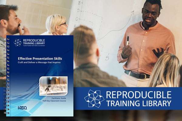
Effective Presentation Skills Customizable Courseware
Create and deliver presentations that truly connect with your audience and inspire them, whether it’s one person or a thousand, to think, feel, and take action.
Buy at HRDQstore.com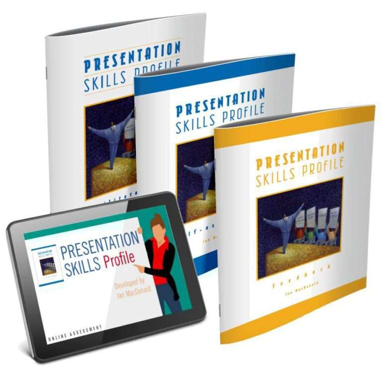
Presentation Skills Profile
Presenting to others can feel daunting. This self-assessment helps you evaluate your preparation and delivery style, gather peer feedback, and follow a step-by-step path to presentation success.
Buy at HRDQstore.comThe HRDQ-U In Review Podcast, brought to you by HRDQU.com, brings you the latest insights and practical tools for enhancing soft-skills training in your organization. As a learning community for trainers, coaches, consultants, managers, and anyone passionate about performance improvement, we interview subject matter experts and thought leaders from recent webinars they presented with us to take a deeper dive into the content they shared and answer all your questions. Join us as we explore new ideas and industry trends, share success stories, and discuss challenges faced by professionals.
The HRDQ-U In Review Podcast is intended for HR and training professionals, organizational development practitioners, and anyone interested in improving workplace performance and productivity.
New episodes of HRDQ-U In Review are released every week.
The length of the episodes varies, but they typically range from 15-30 minutes.
The podcast covers a wide range of topics related to HR and organizational development, including leadership development, team building, communication skills, conflict resolution, employee engagement, and more.
No, HRDQ-U In Review is completely free to listen to.
You can listen to any available HRDQ-U In Review Podcast right on our website at HRDQU.com via our embedded Spotify player on the related webinar page. In addition to our self-hosted option, you can find the HRDQ-U In Review Podcast on many of the popular streaming services, which are listed above.

Download our catalog of our top 20 most popular webinars.